We design the not yet
We design the not yet
Our branding agency creates verbal and visual identities for companies looking to stand out and turn heads. Each of our brands are crafted with a unique narrative that unlocks value, and liberates your idea into the world.


Wild Thingz
Punk, not junk


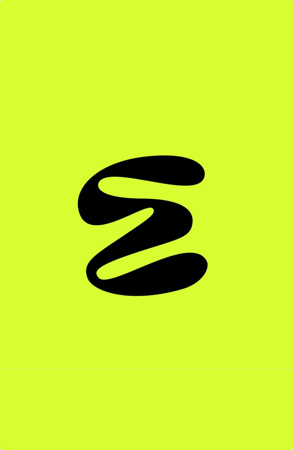
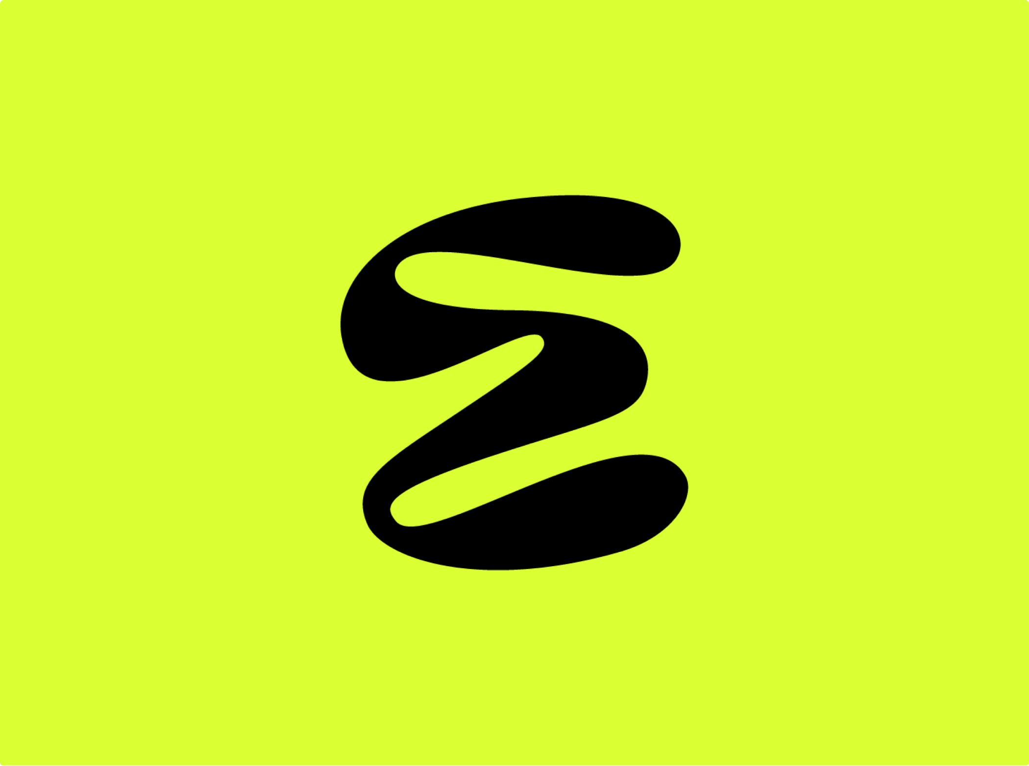
Kaorium
COMING SOON


The Wombles
The UK's original environmentalists
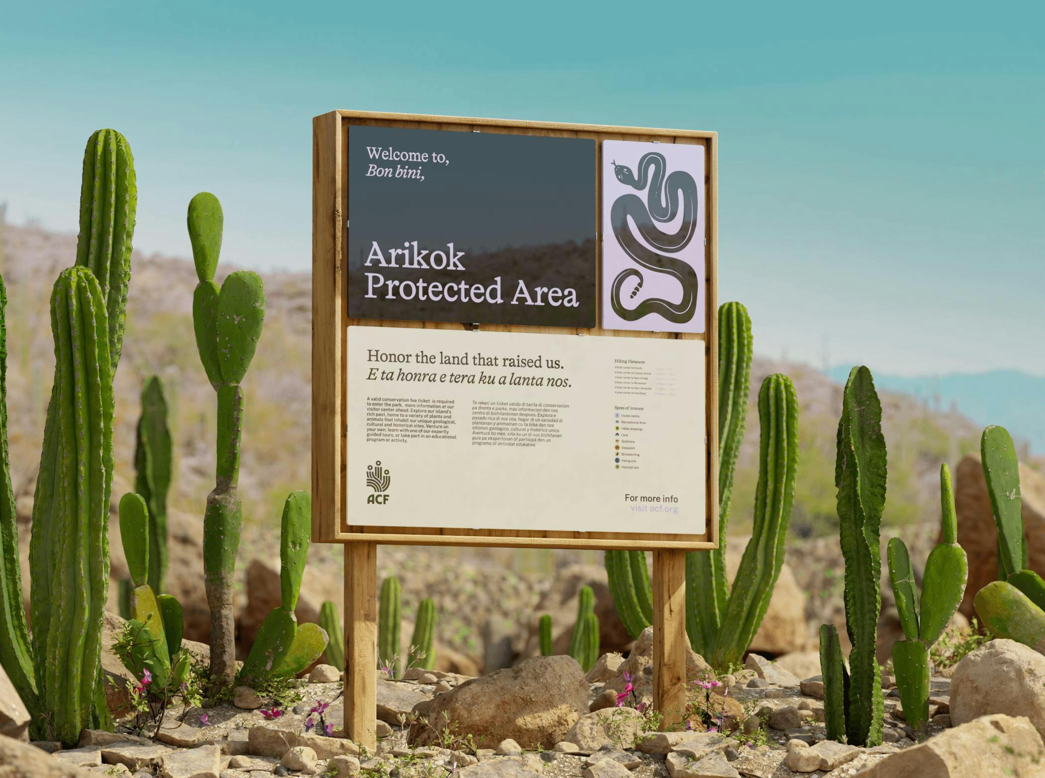
Aruba Conservation Foundation
Amplifying the whispers of Mother Aruba
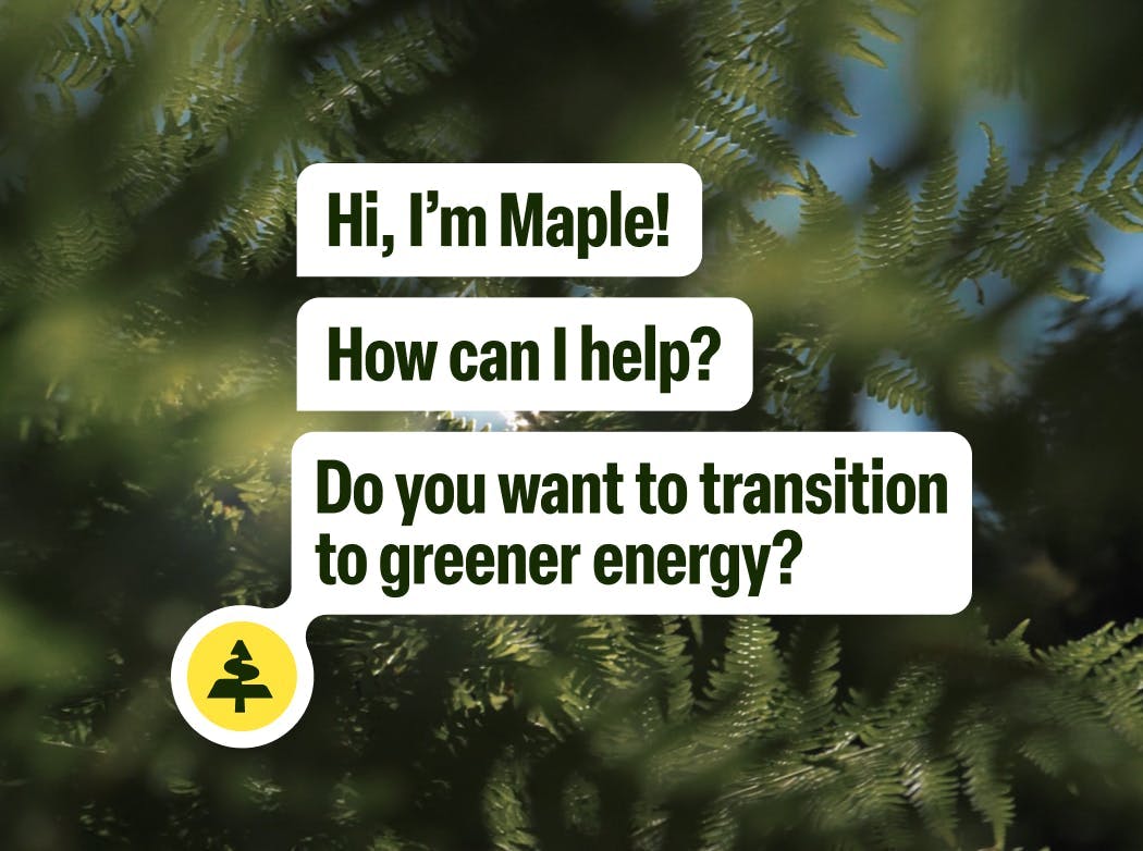

Hometree
Accelerating the transition to net zero homes

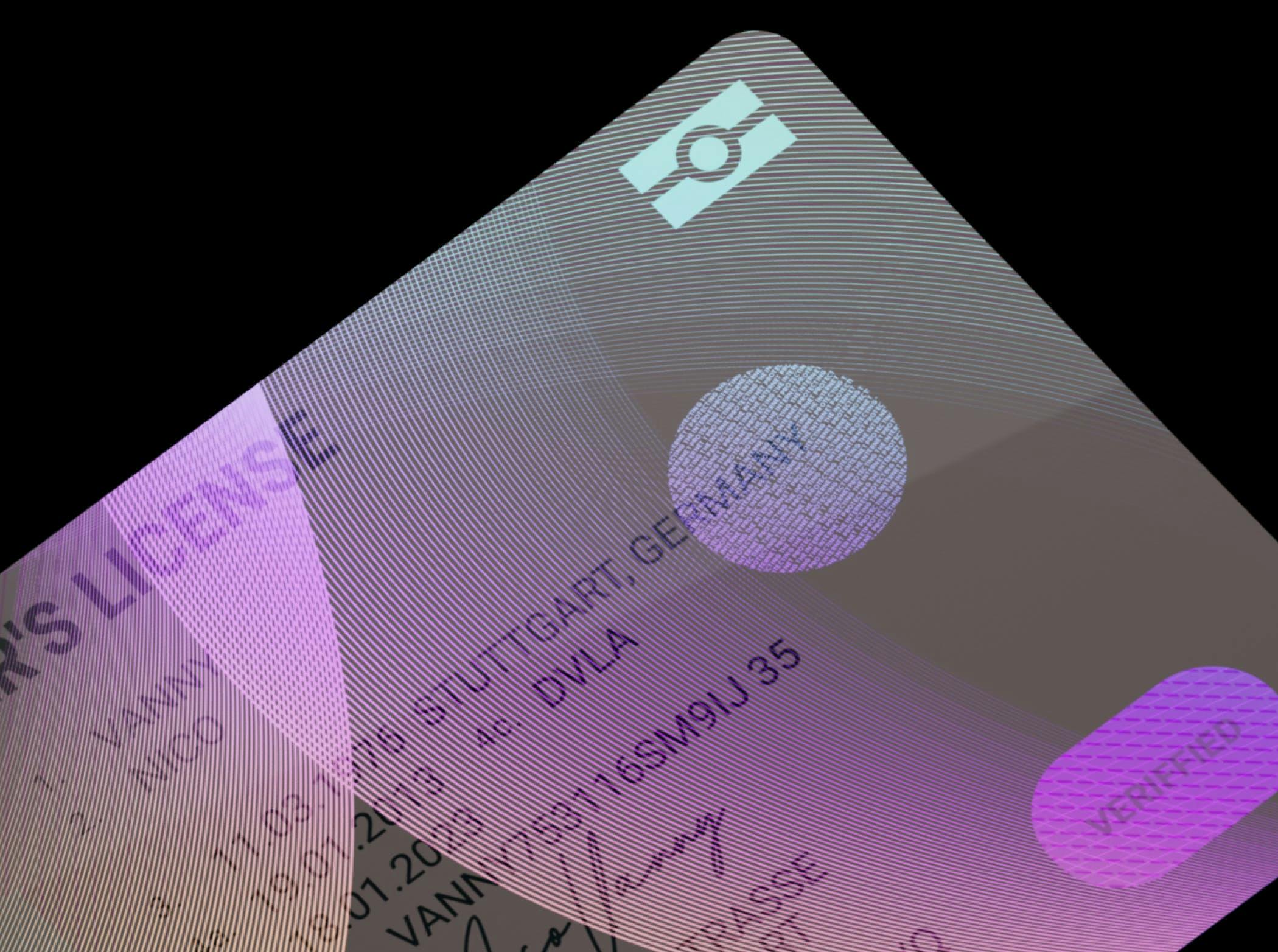
Yango Maps
Navigating life in the streets of Dubai
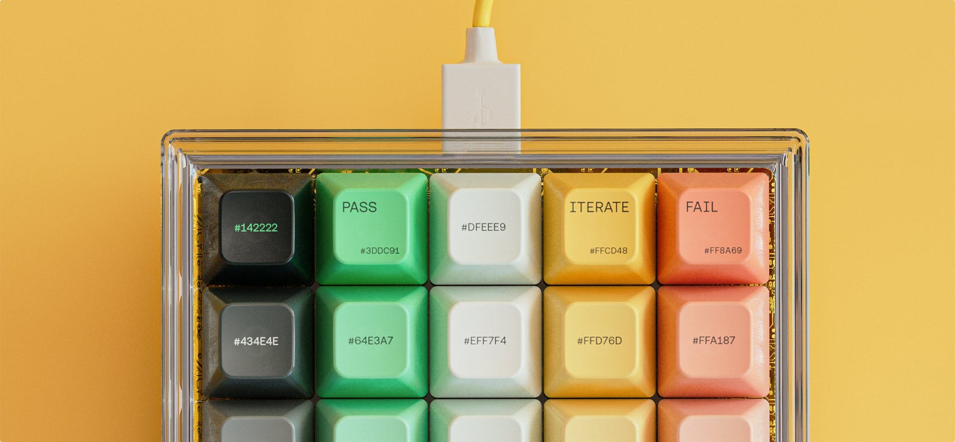

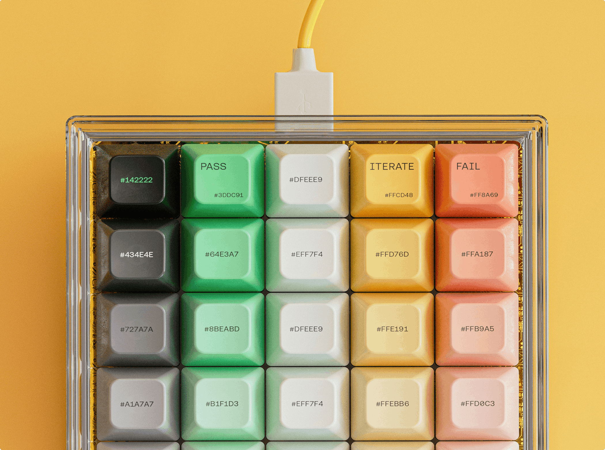
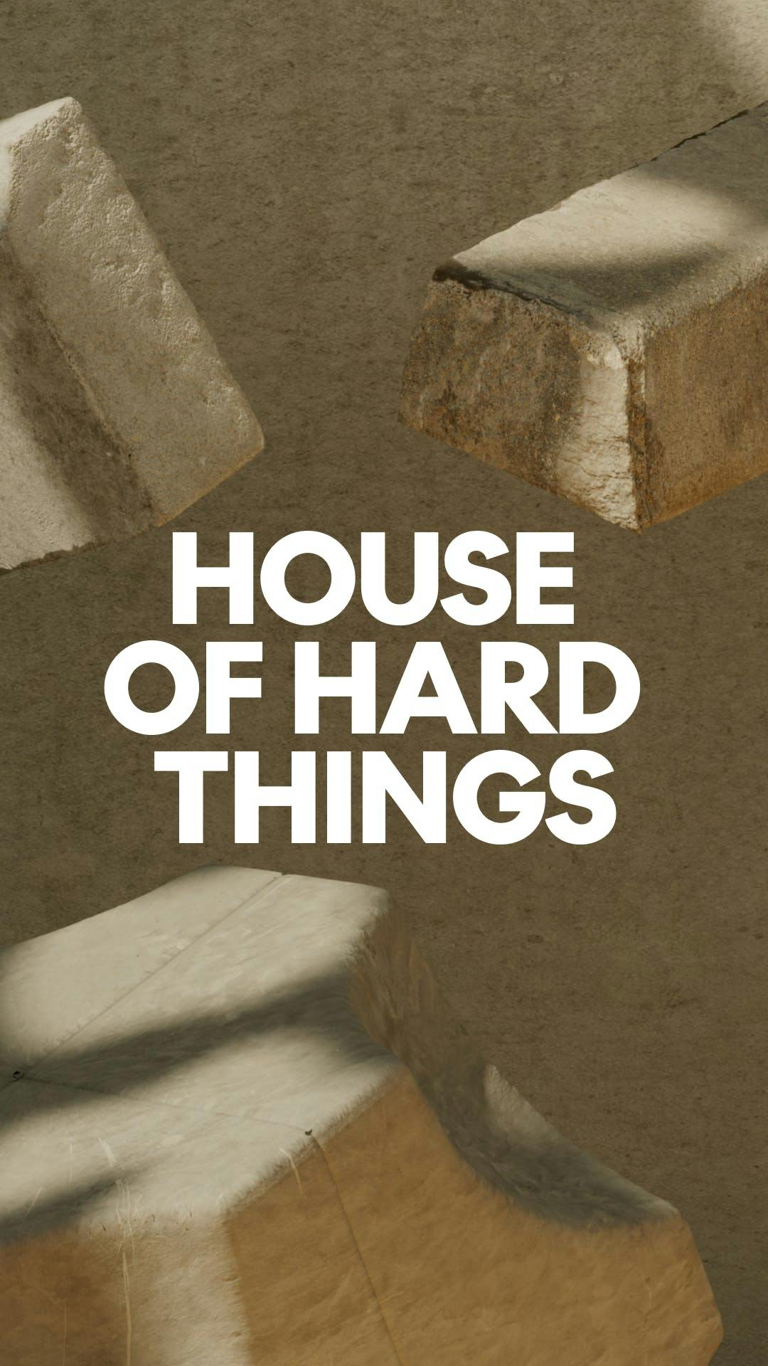
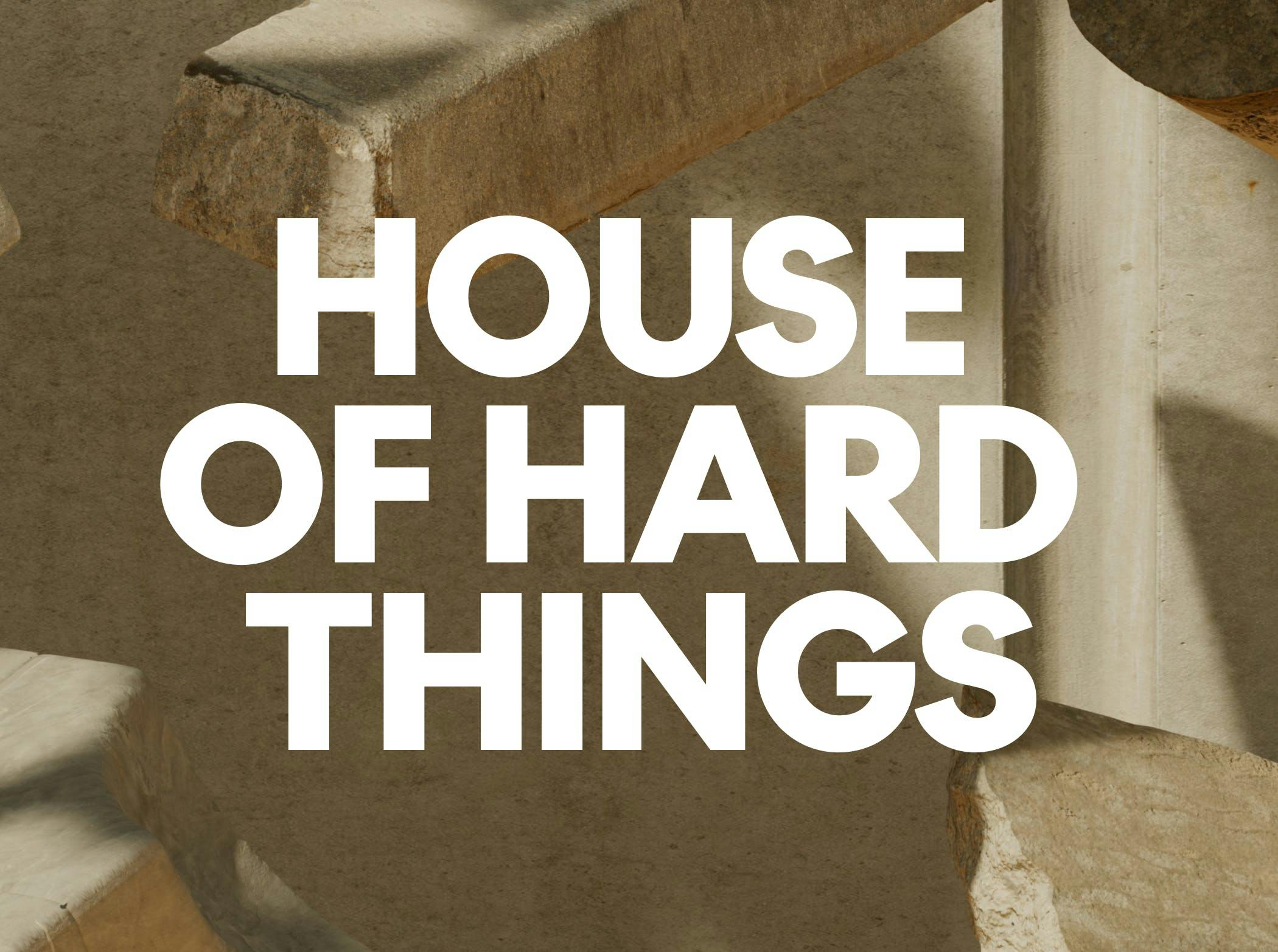
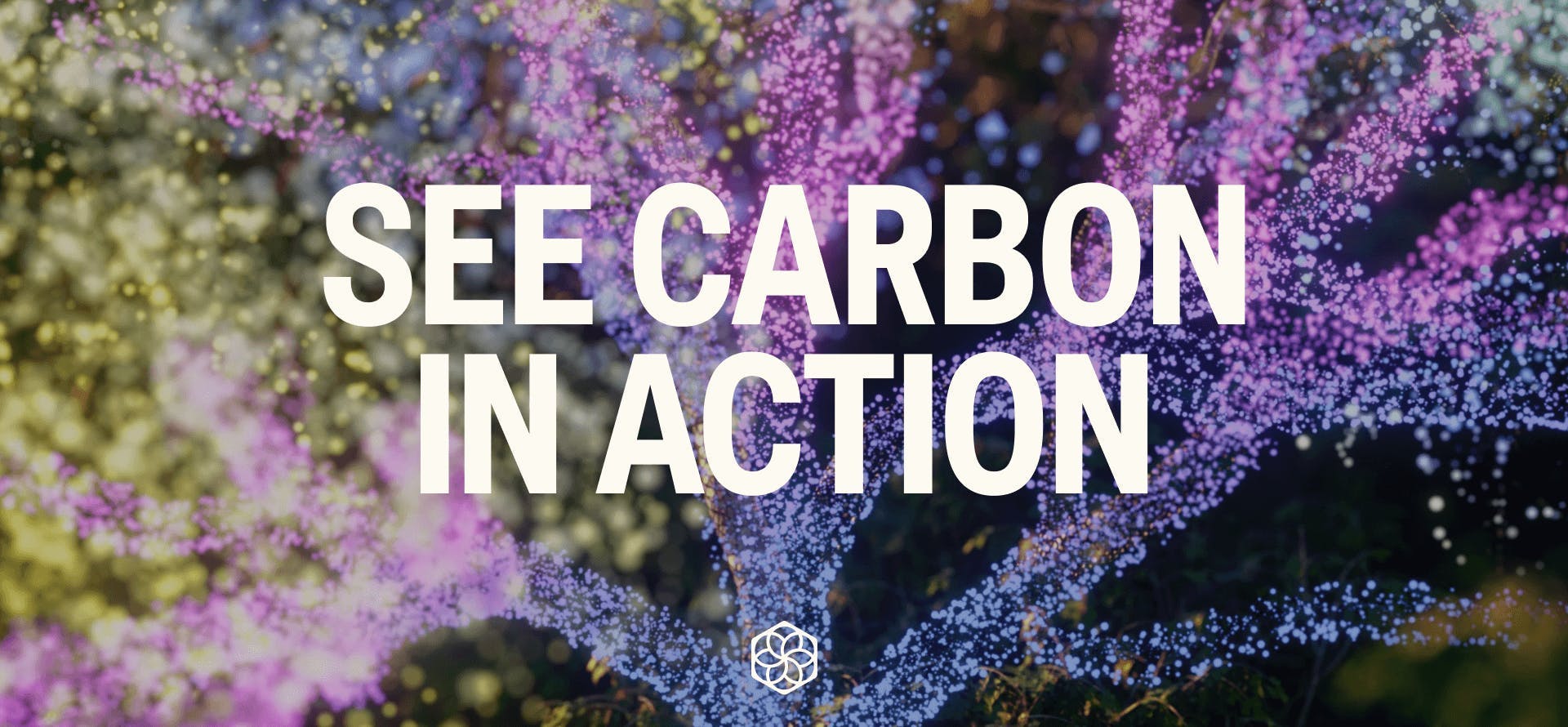
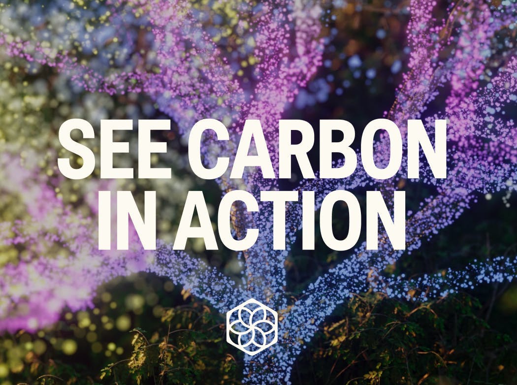
Biozeroc
Helping a carbon-neutral concrete startup spread the hard truth
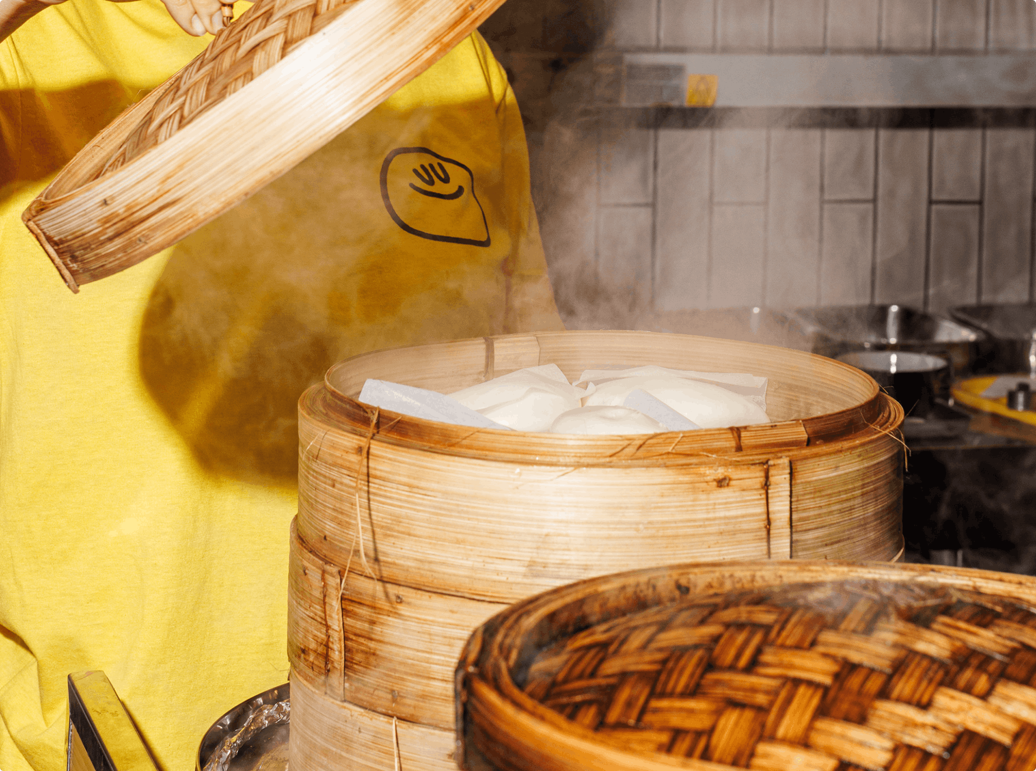
Yum Bun
Raising the bar on street food

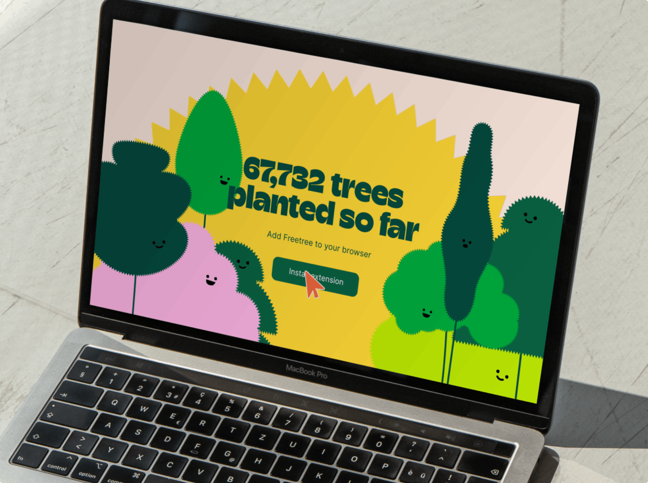
Freetree
Growing fuzz for a tree-planting browser app

On the Edge
Making conservation less conservative

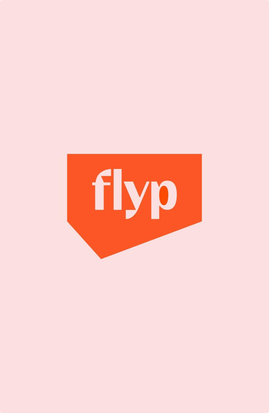

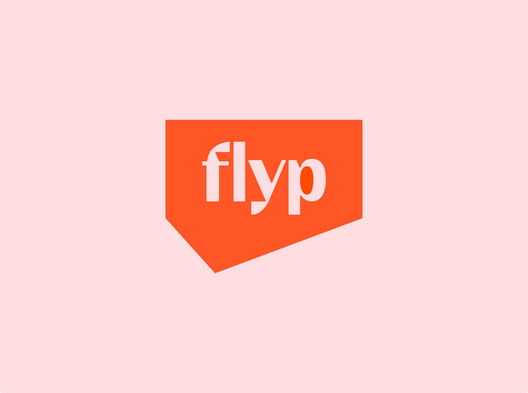
flyp
Flipping the property system
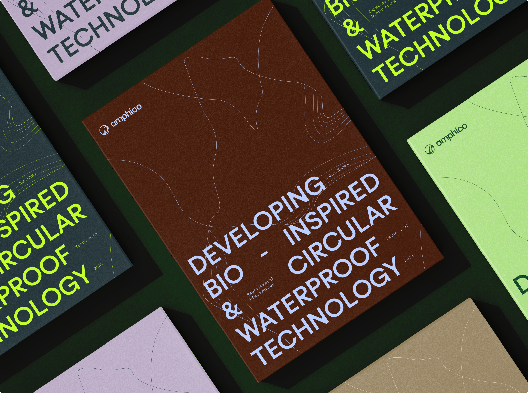
Amphico
Leading the outdoor industry towards a circular future

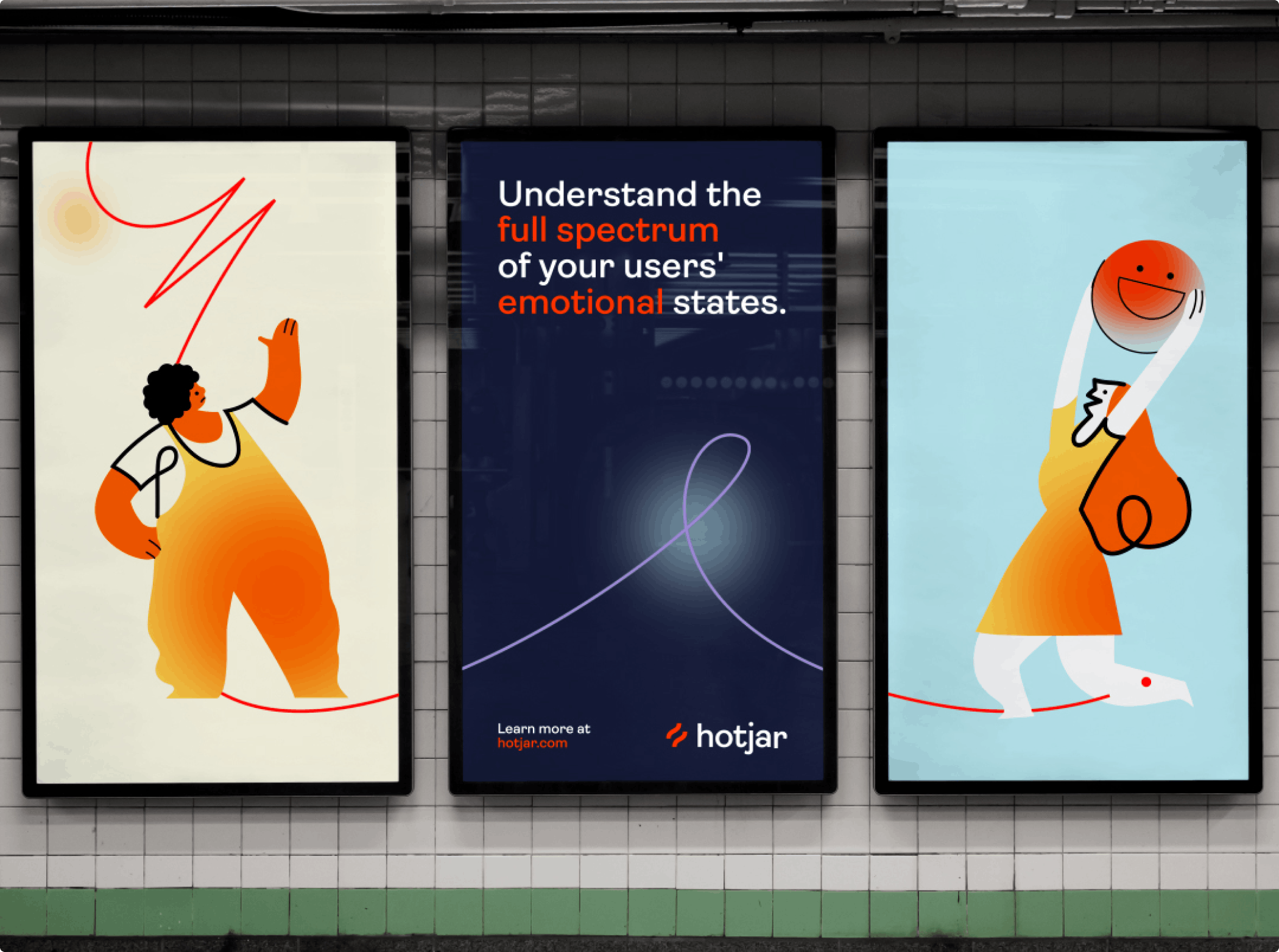

Hotjar
Visualising emotion for an enterprise user insights platform
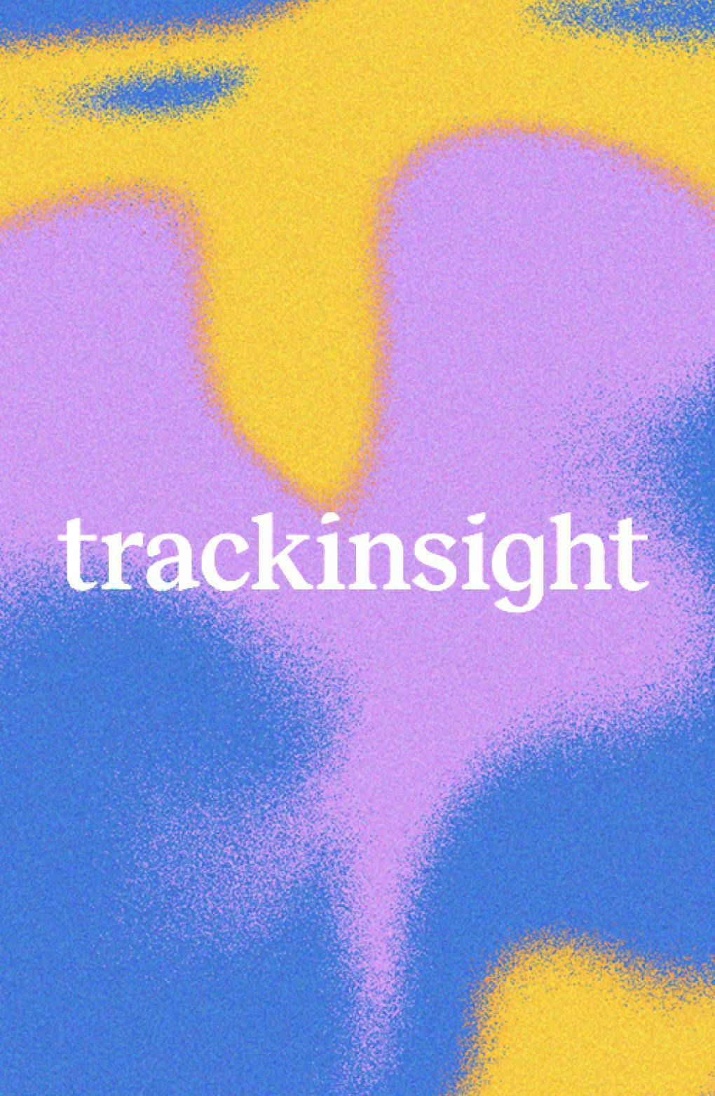

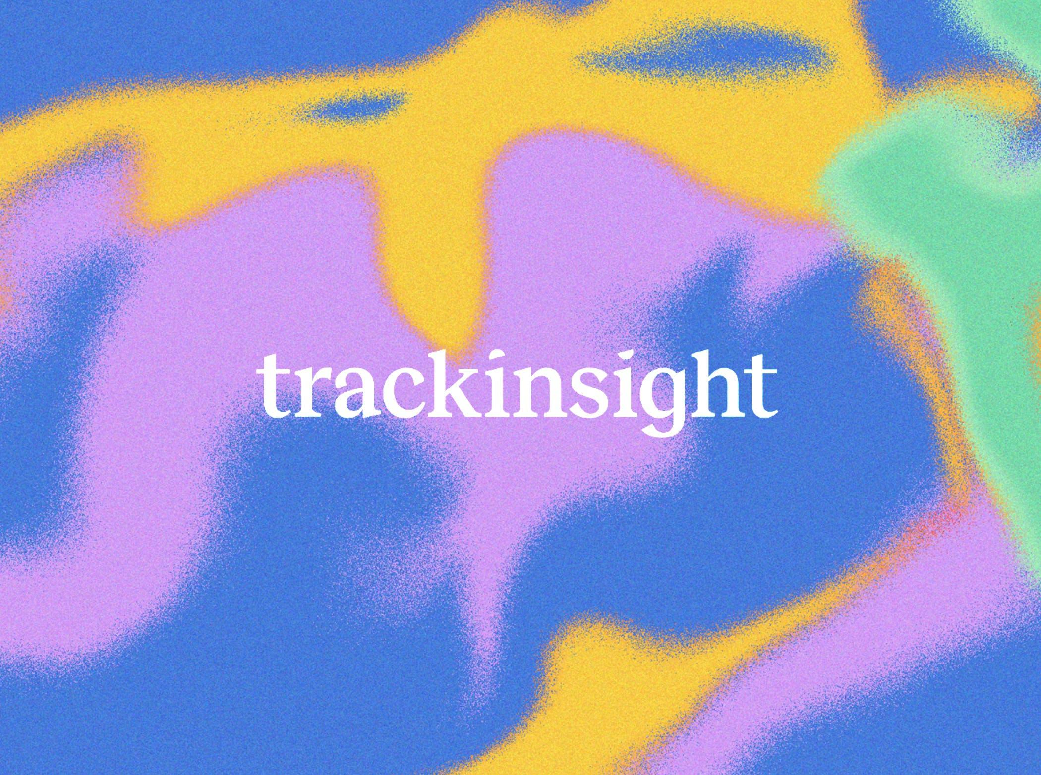
Trackinsight
An oasis of calm in the noisy world of ETFs
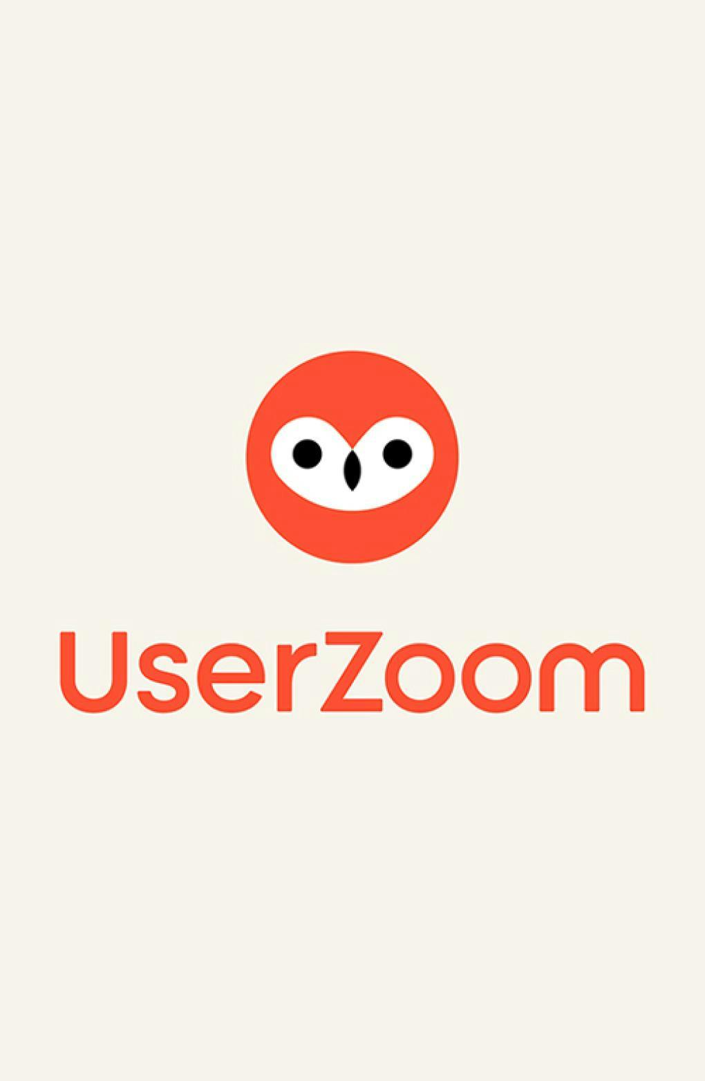

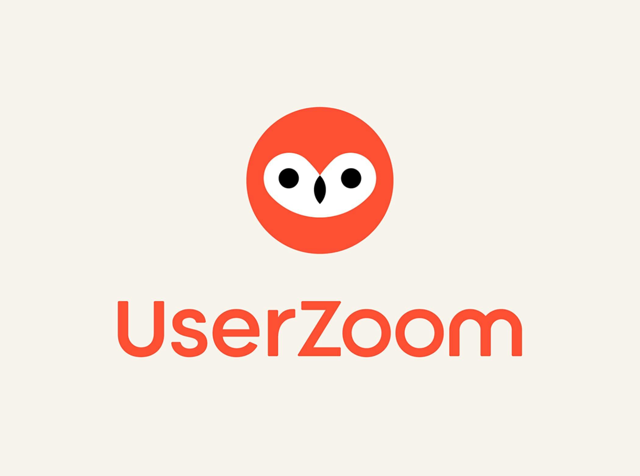
UserZoom
Breathing wisdom and warmth into the leading UX insights platform
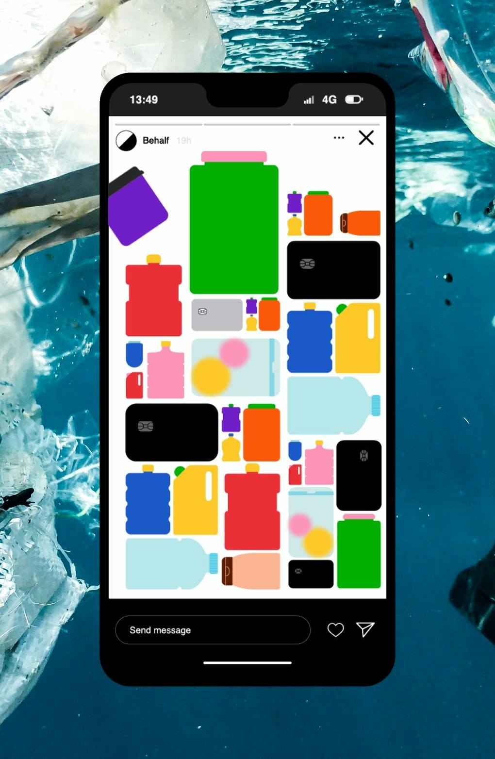

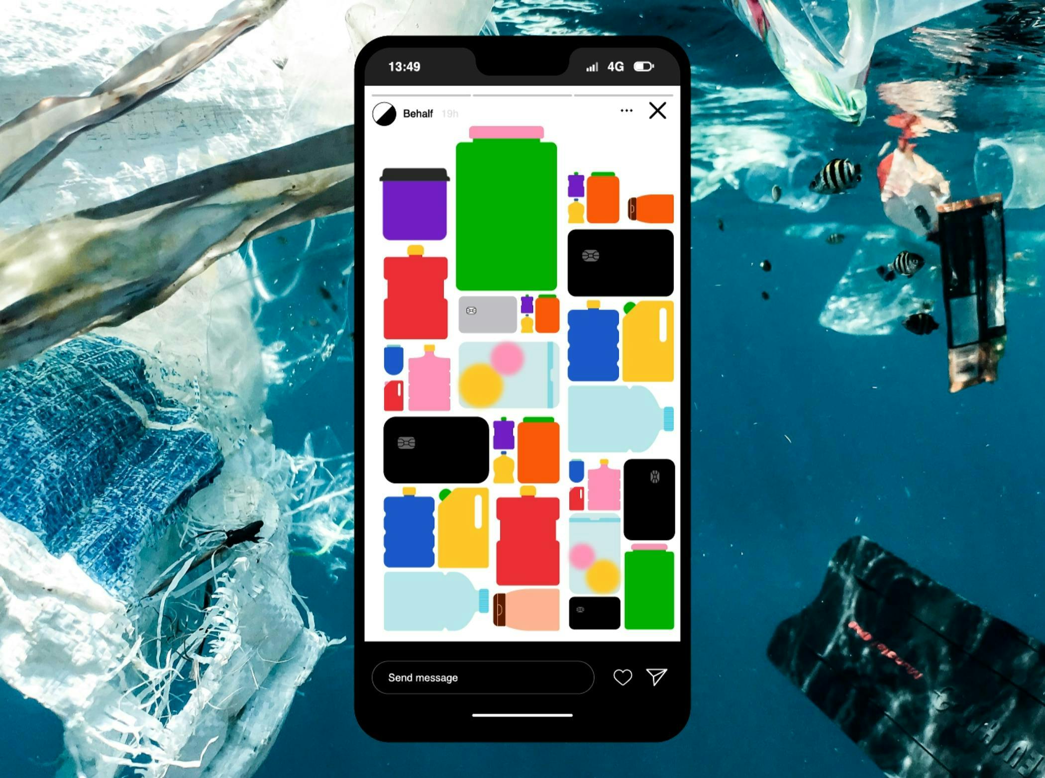
Eat Less Plastic
A campaign to raise awareness on ocean plastic
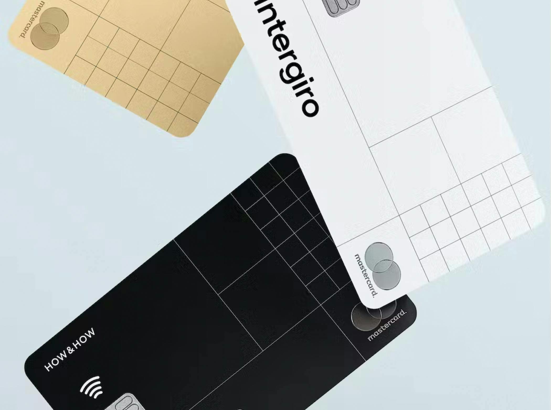
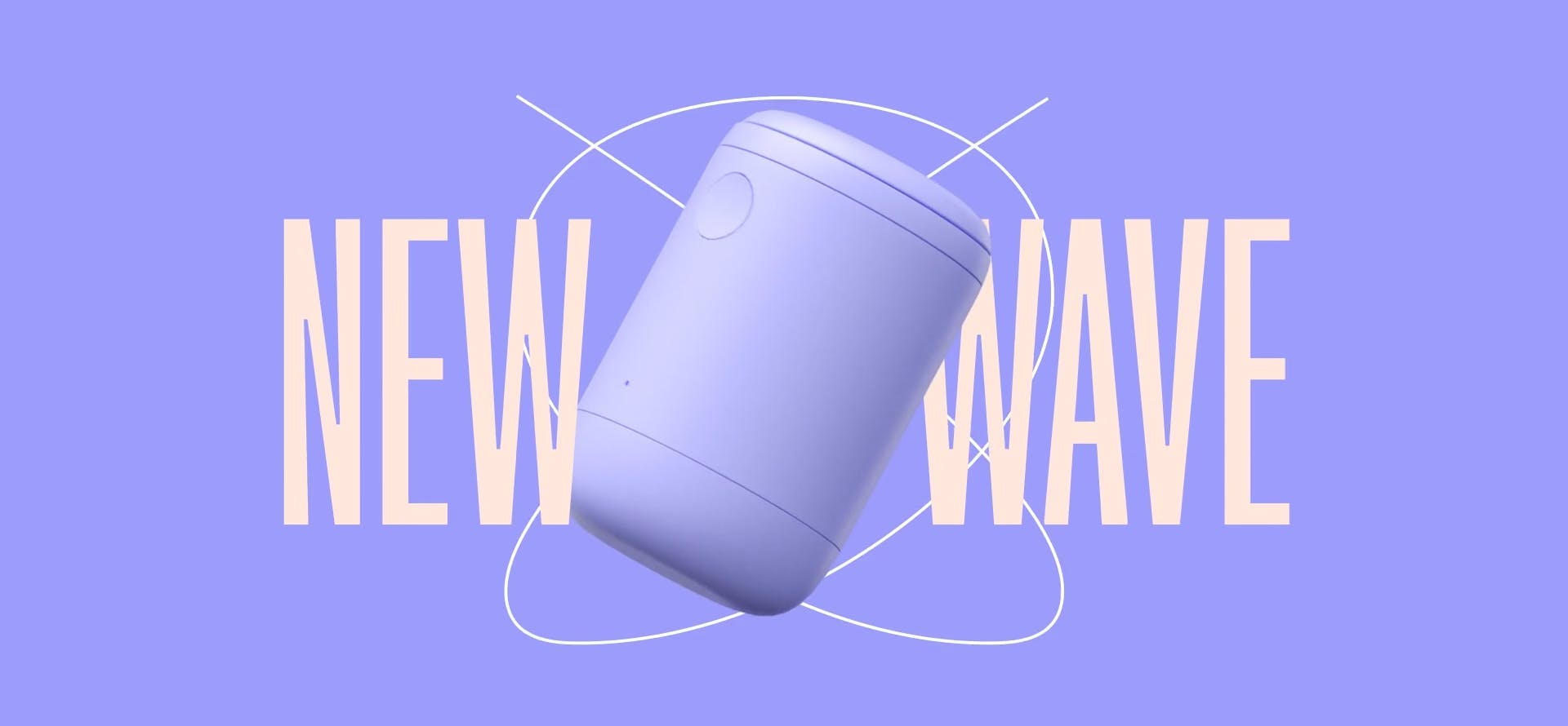
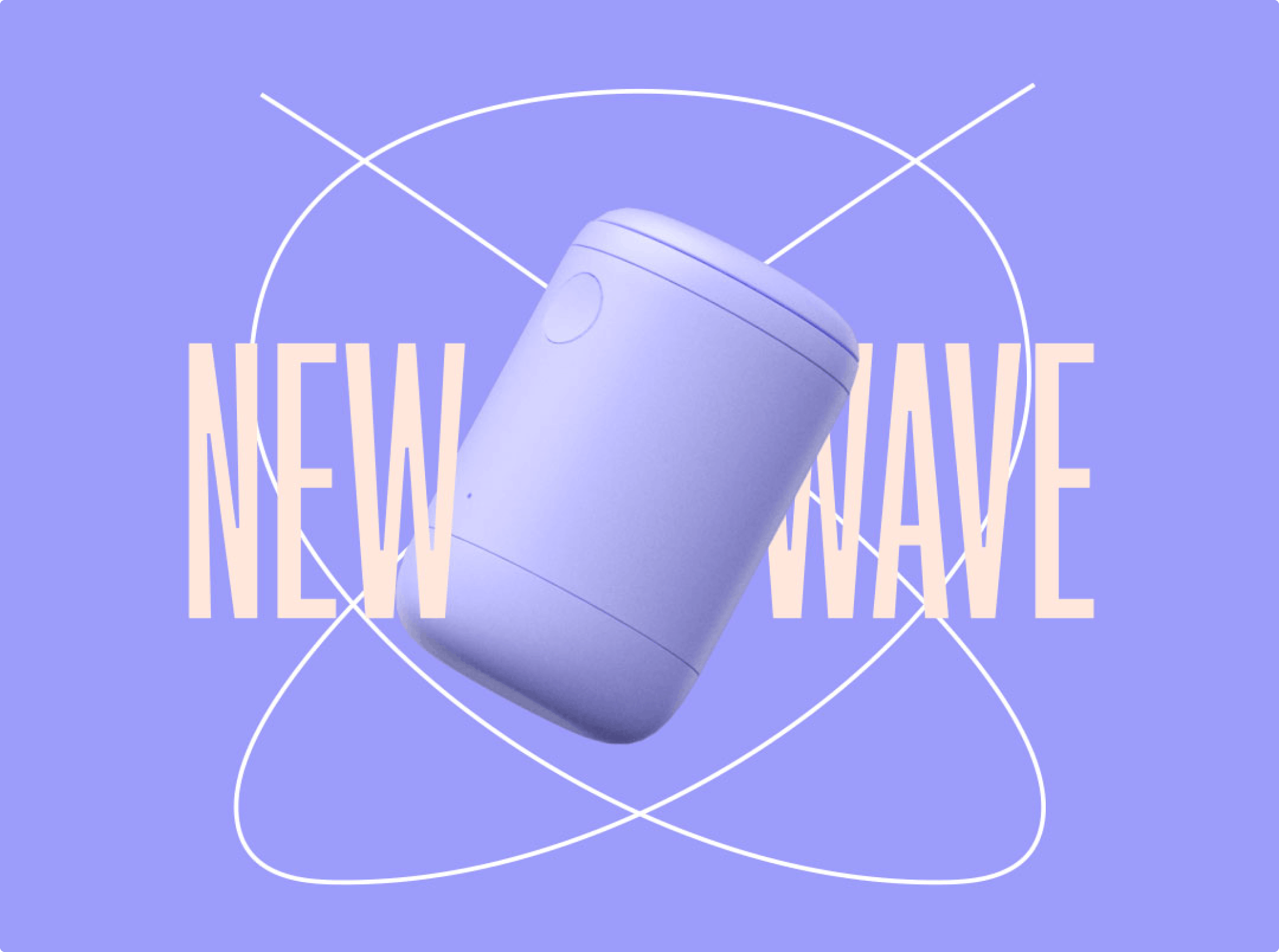
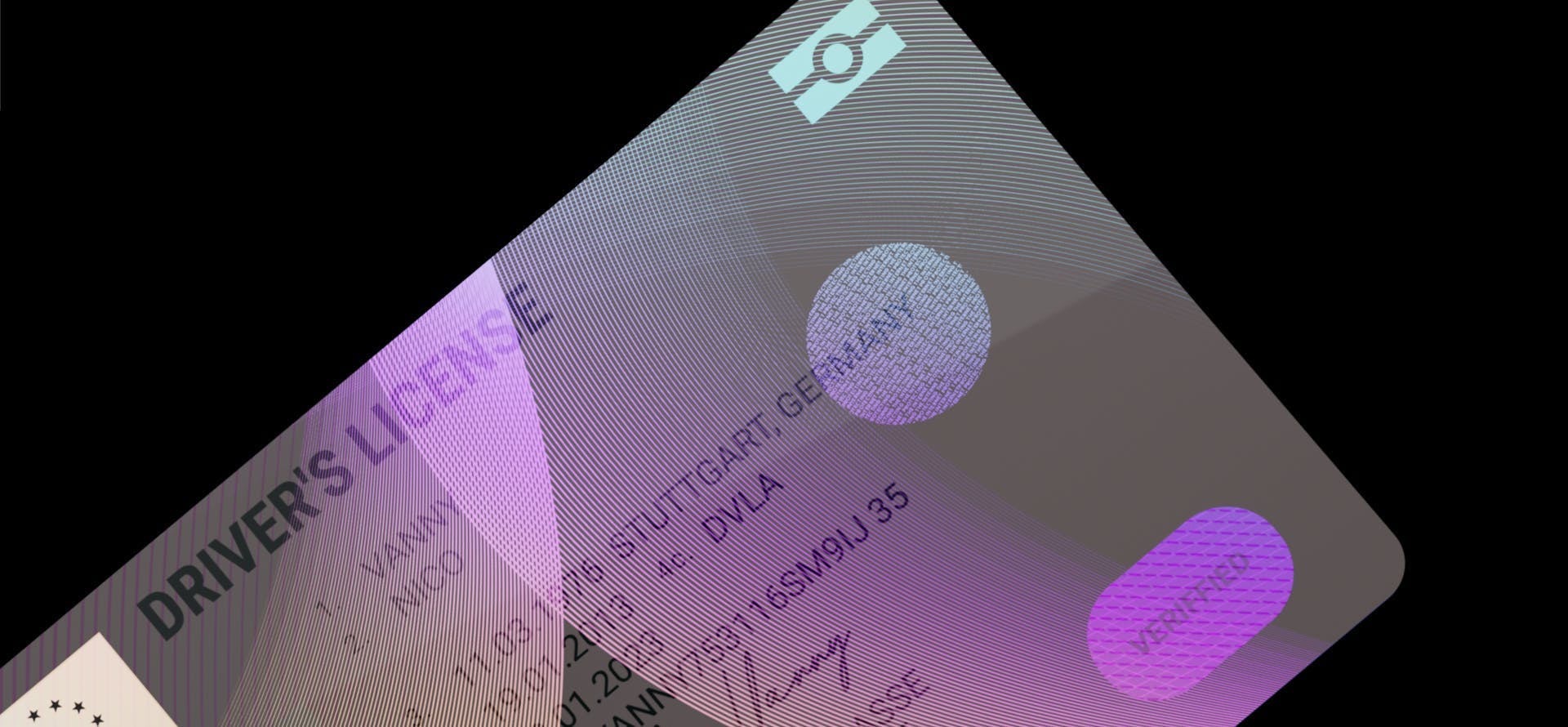
Intergiro
Launching an evolutionary business bank
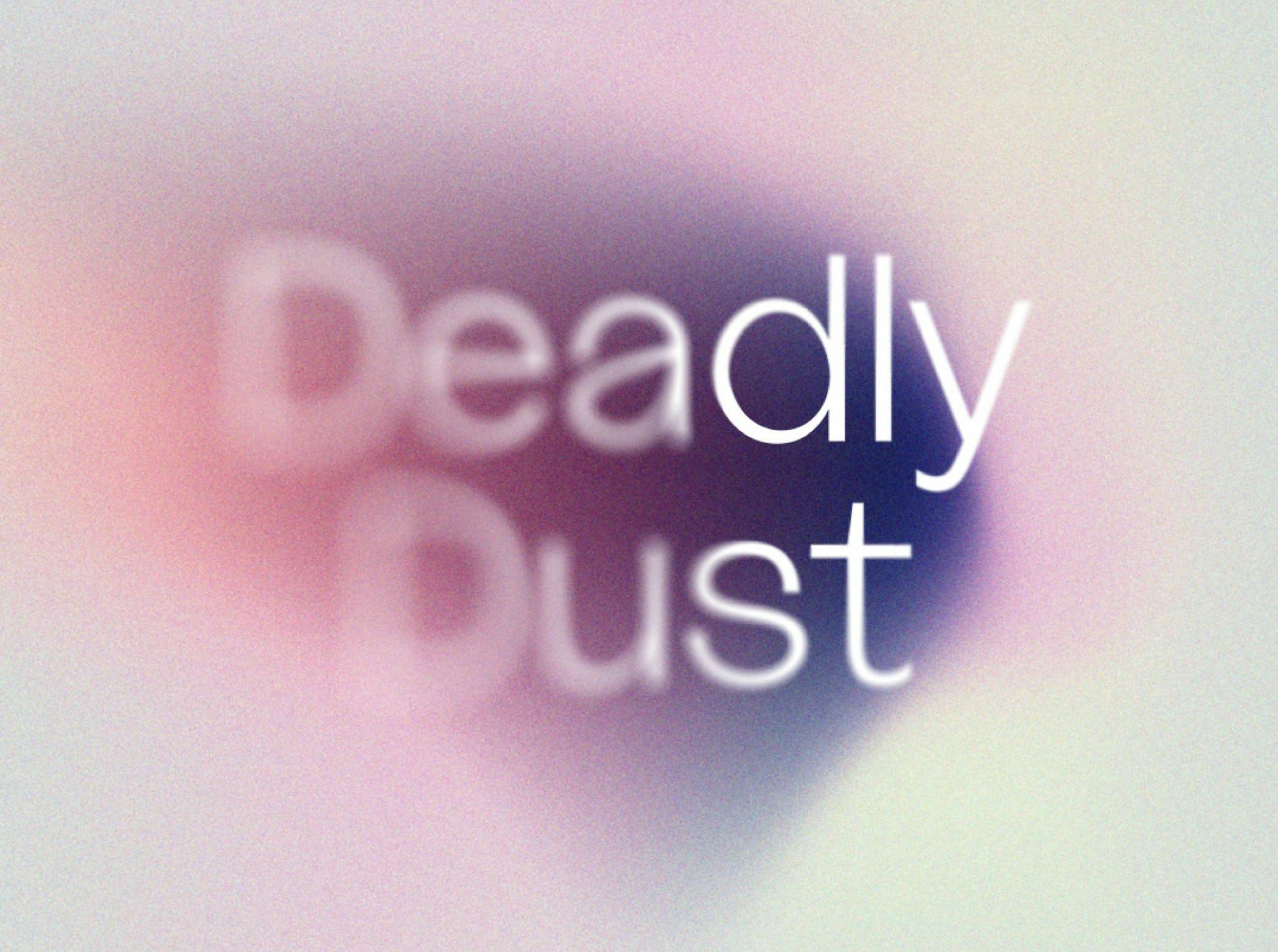
Deadly Dust
Raising awareness on car tyre microplastic pollution
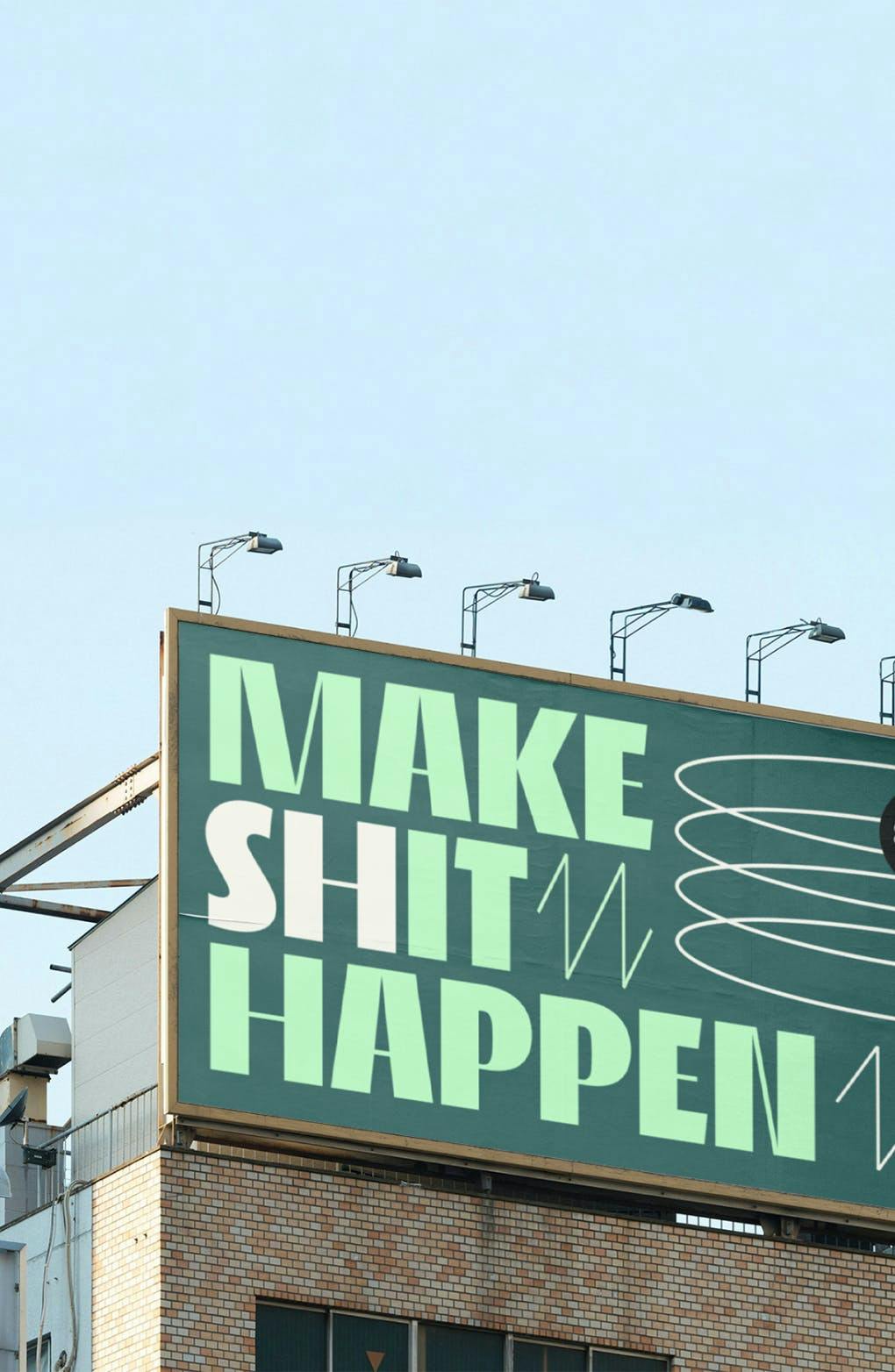
One Green Bean
Putting the spring back in the step of a global ad agency
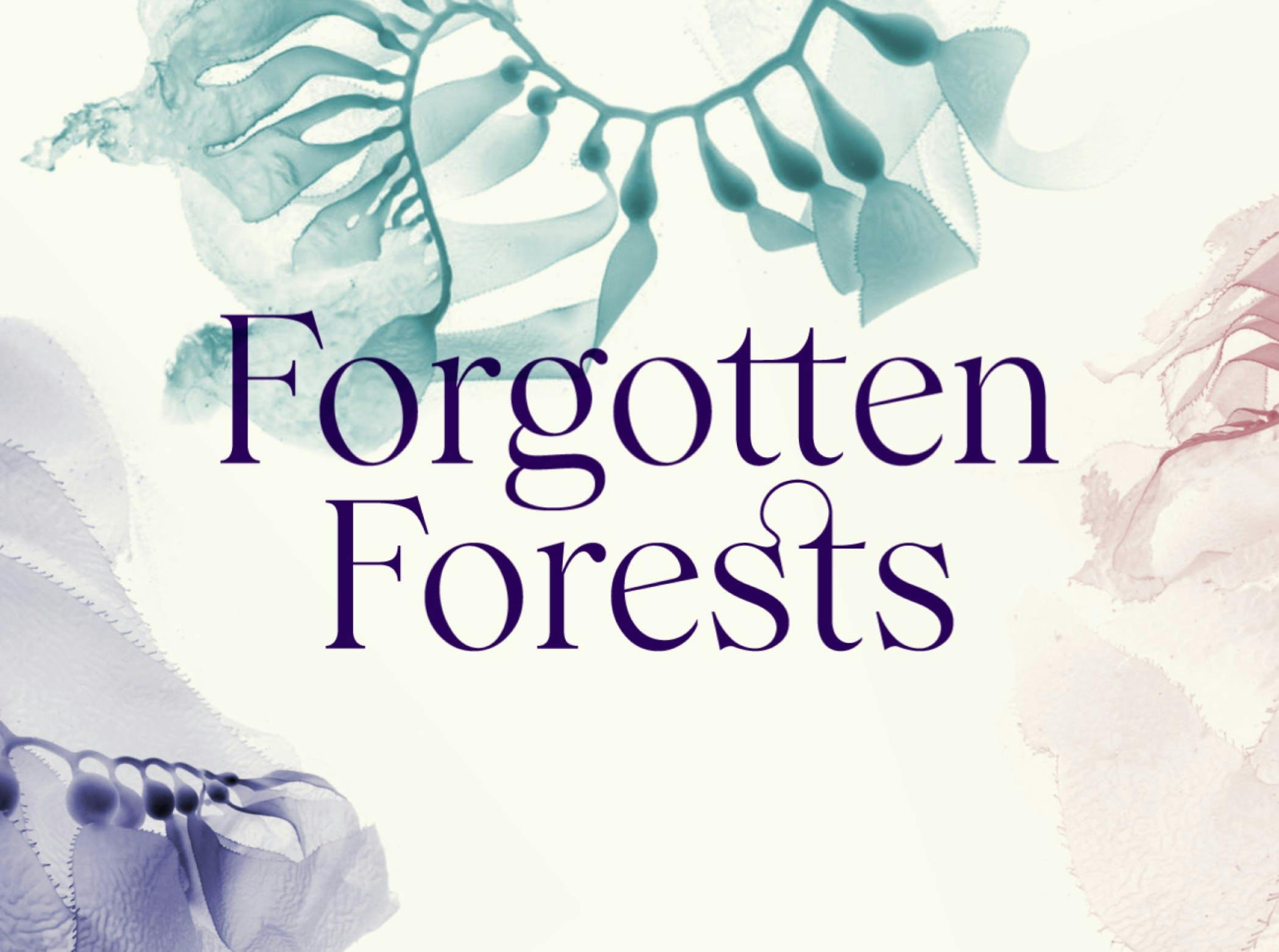

Forgotten Forests
Growing hope for the environmental benefits of restoring sea kelp forests
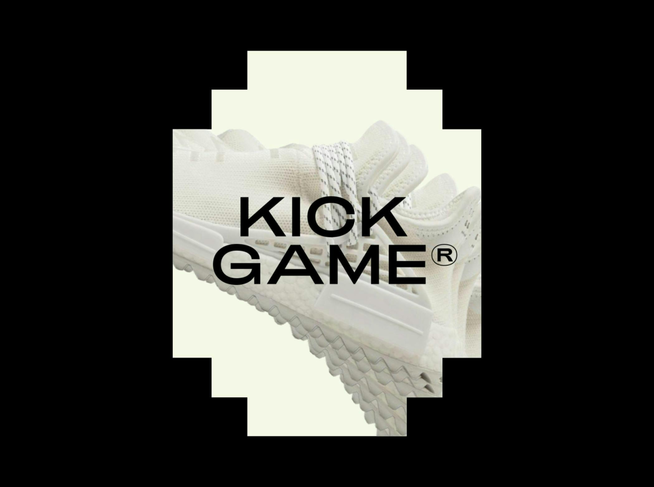

Kick Game
Elevating sneakers into a 'new luxury' artform
E15
Funding the agents of change through a sustainable investments app

© 2025 How&How Ltd