
Hotjar
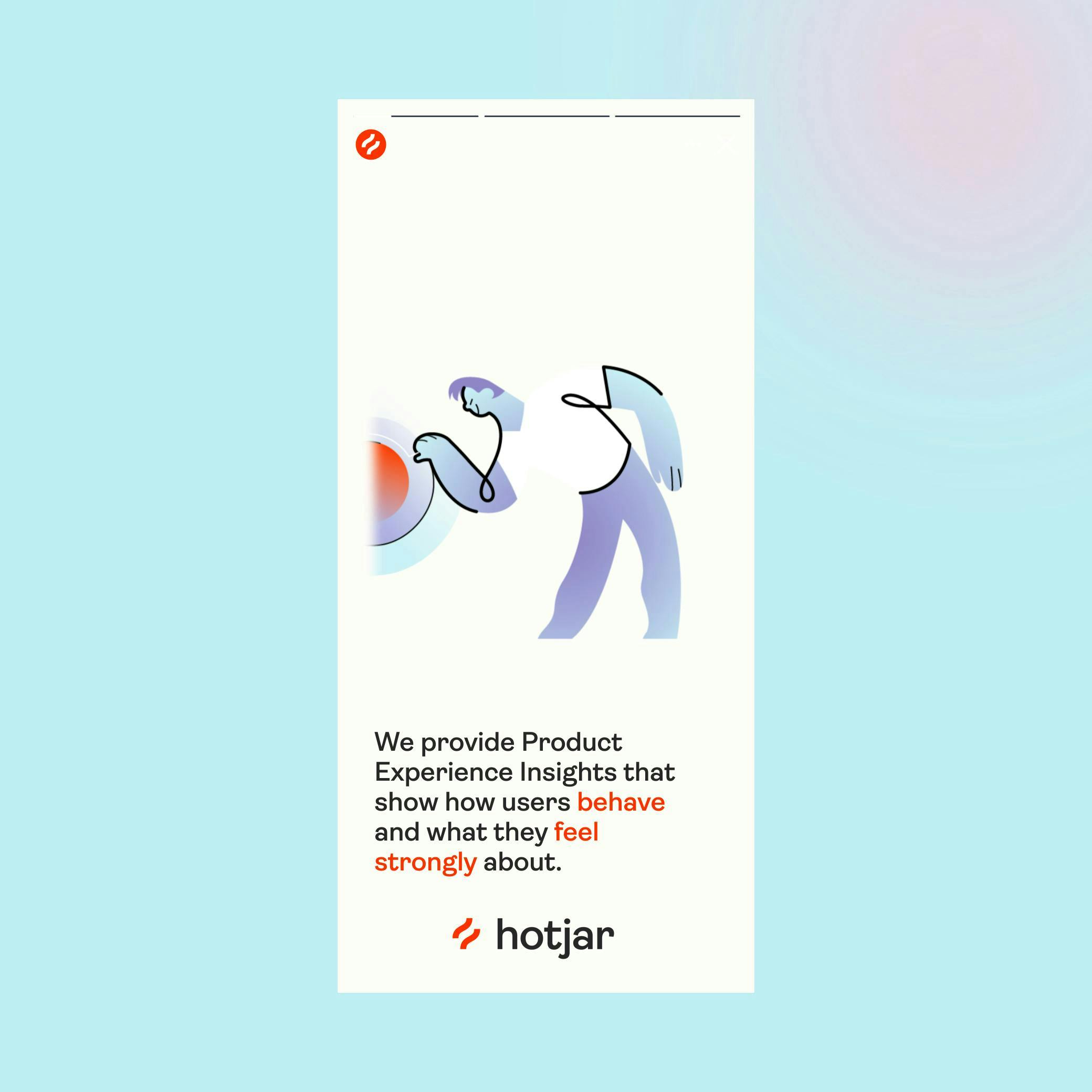
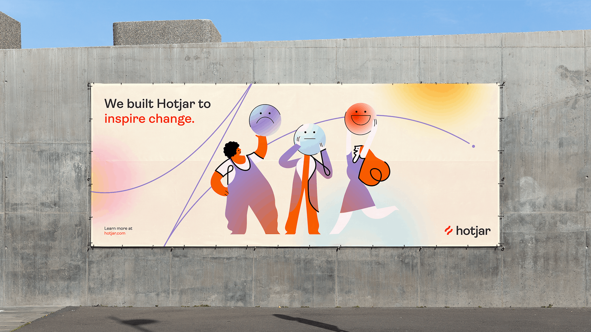
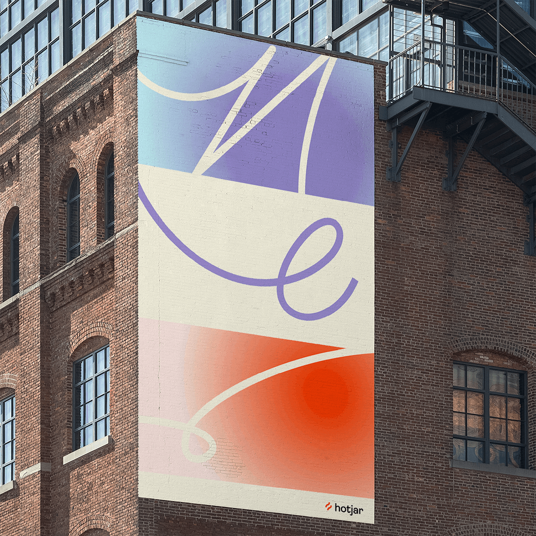
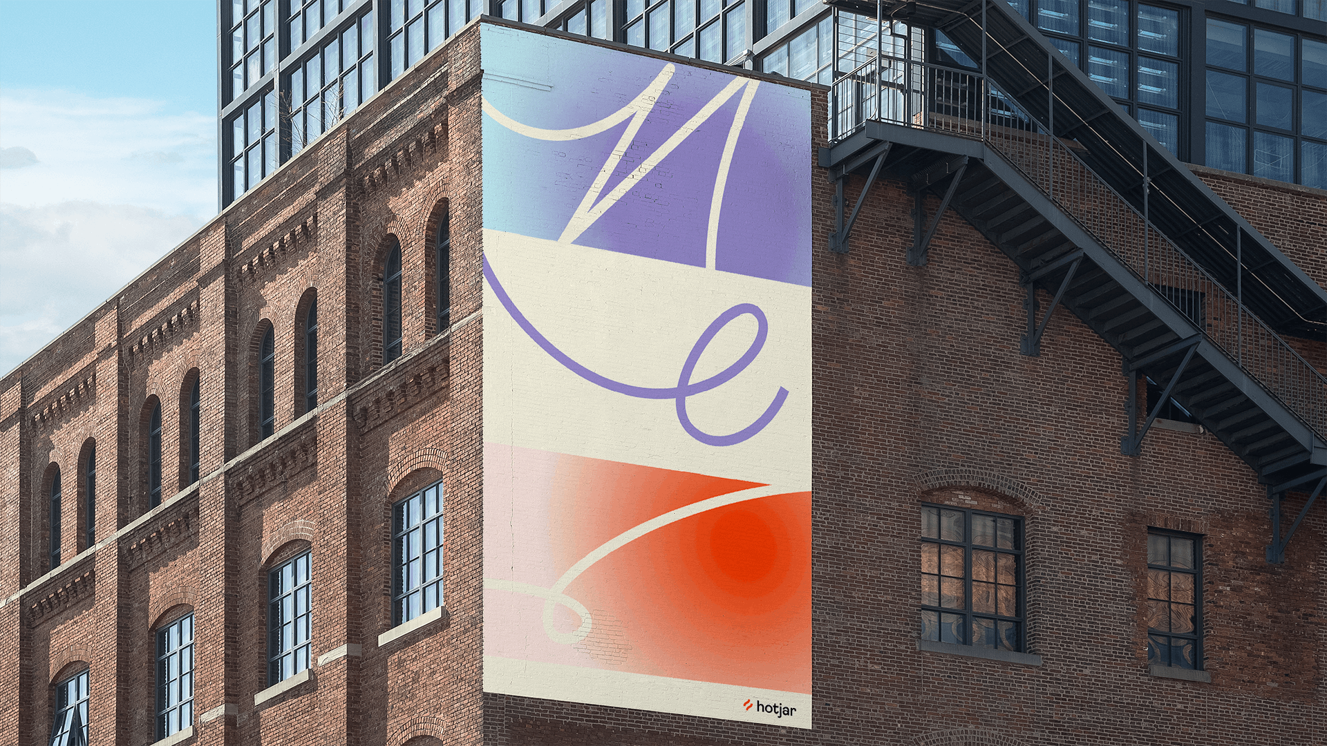
Visualising emotion for an enterprise user insights platform

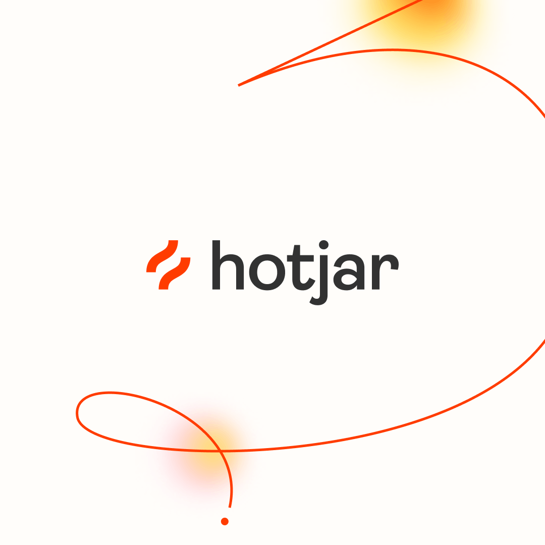
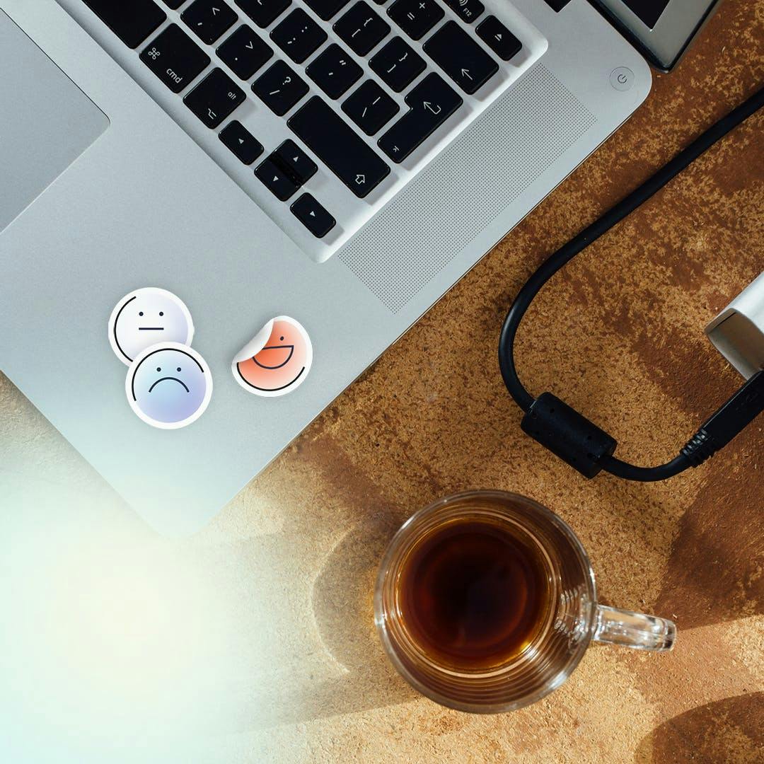
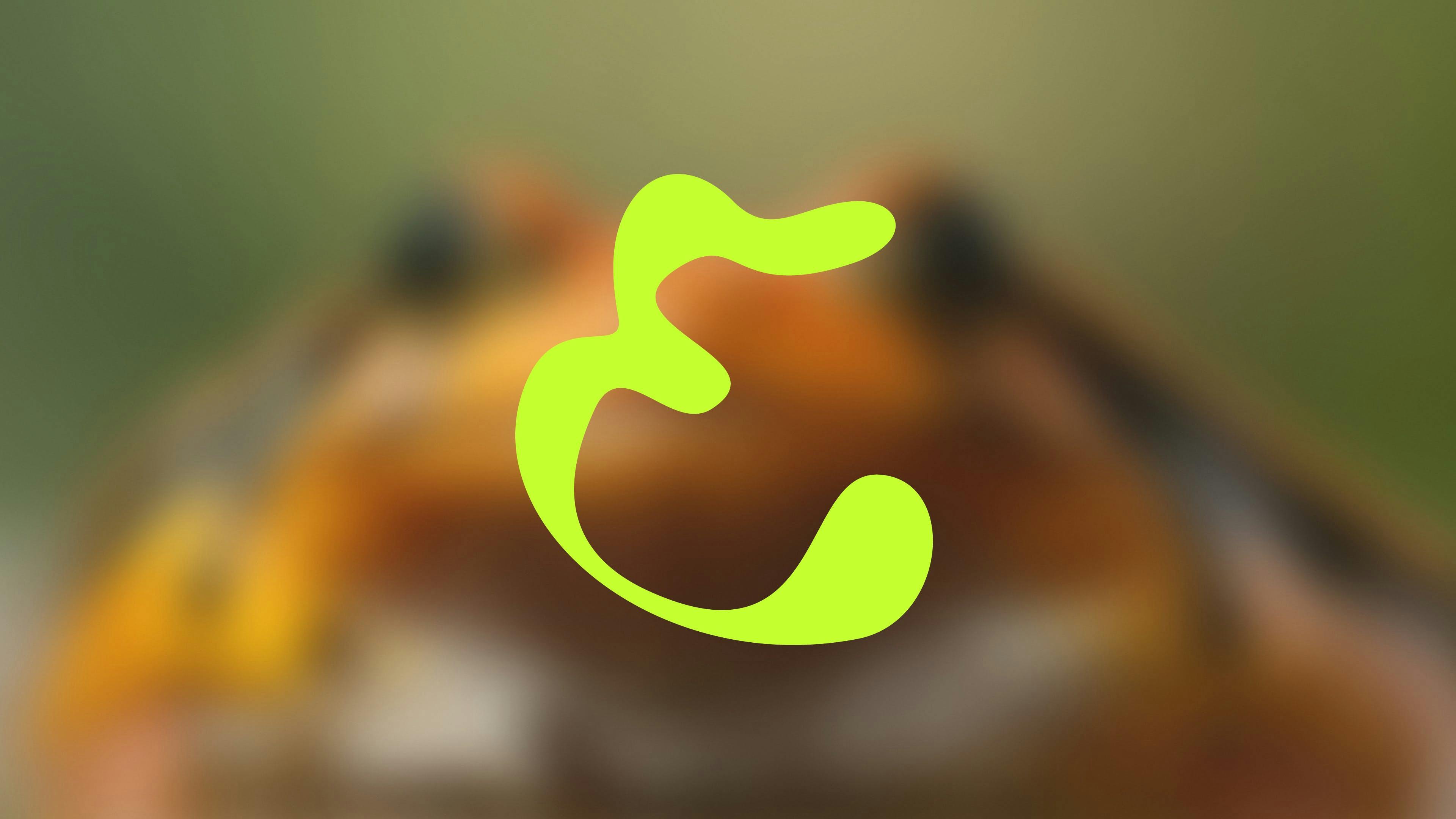
The IconDesigning at 16px
One of the most challenging elements of the rebrand, was having to design an icon which could easily be legible and recognisable at 16px by 16px. From the outset, all design considerations had to work on this scale first and foremost as it was the most important touchpoint of the Hotjar brand (seen on millions of website feedback widgets across the globe).
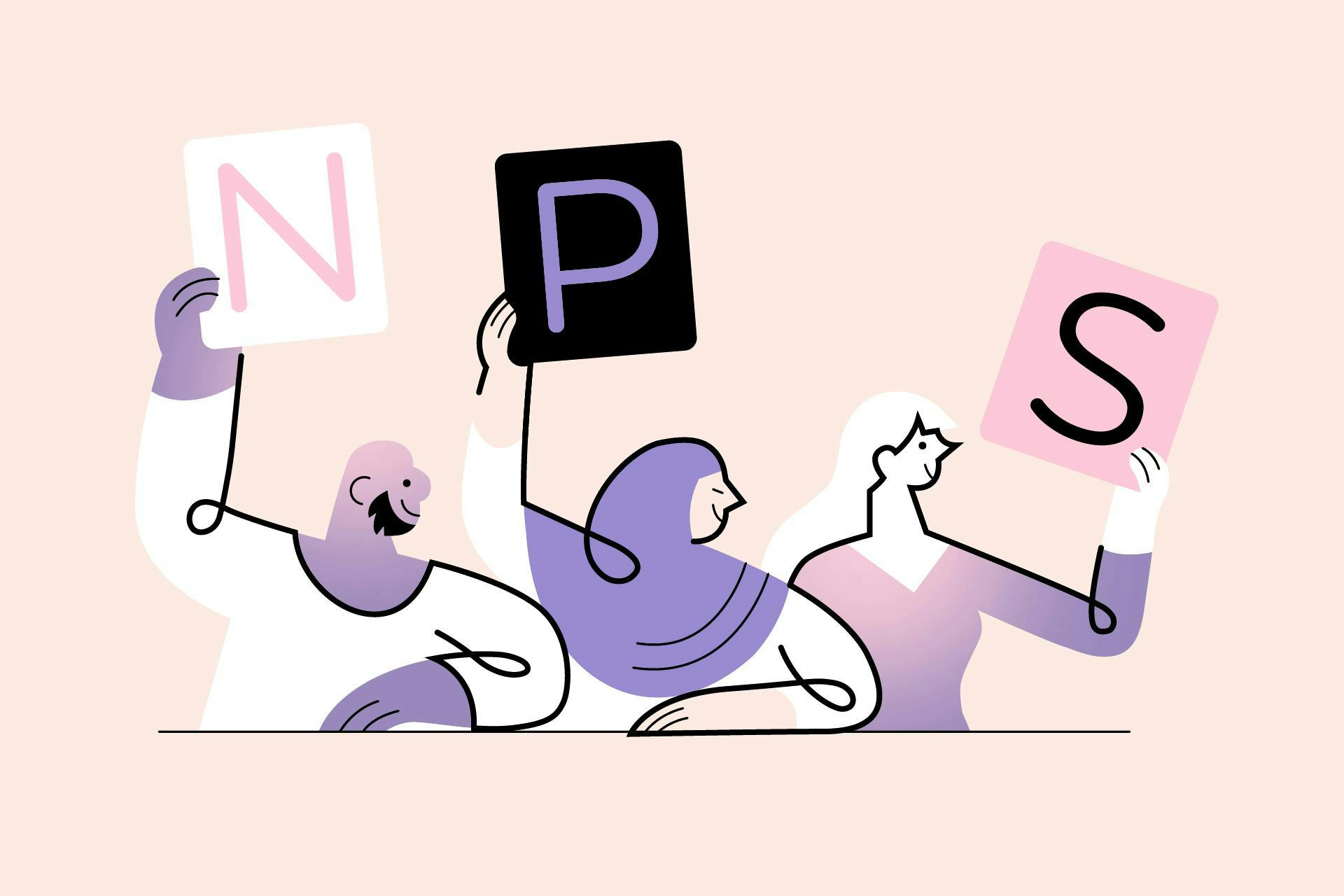
The icon also needed to be able to scale up with ease, and include implicit references to Hotjar's unique Purpose and Product Vision.


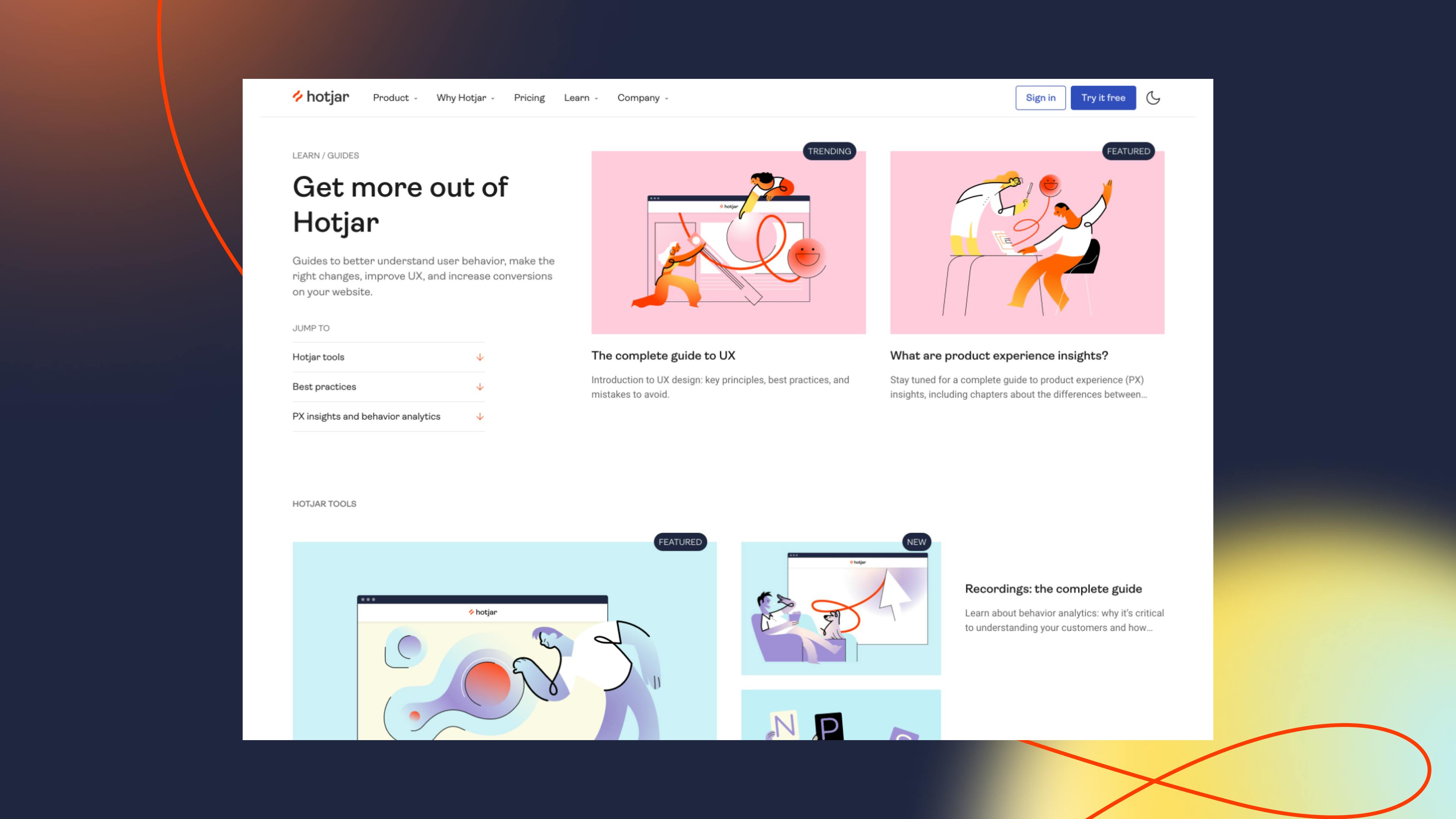
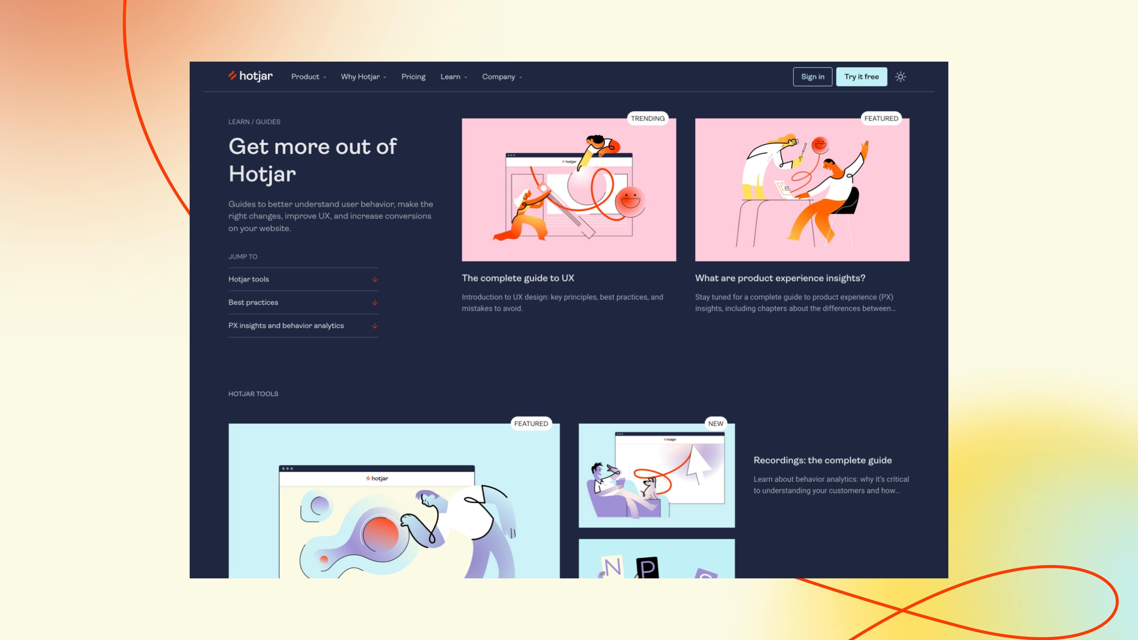


"This project was a major undertaking as it involved a full rebrand, creating a new illustration style to match it, redesigning our website from scratch and migrating it to a new CMS, and restyling our product — and we couldn’t be happier with having selected How&How for this project!
"They took the time to understand our team, our mission and our product, and helped us incorporate all of those elements into our new brand in a way that’s true to both who we are but also to where we’re headed. They’re professional yet friendly, highly creative yet organized, and they were extremely responsive and accommodating to our changing needs as the project evolved. We’re really proud of our new brand and redesigned website, and enjoyed collaborating with How&How on this just as much as we love the final result!"
Director of Product


View More Work


© 2026 How&How Ltd