
AIQ
Harnessing magnetic attraction for a leading CX platform


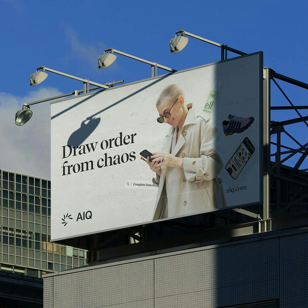
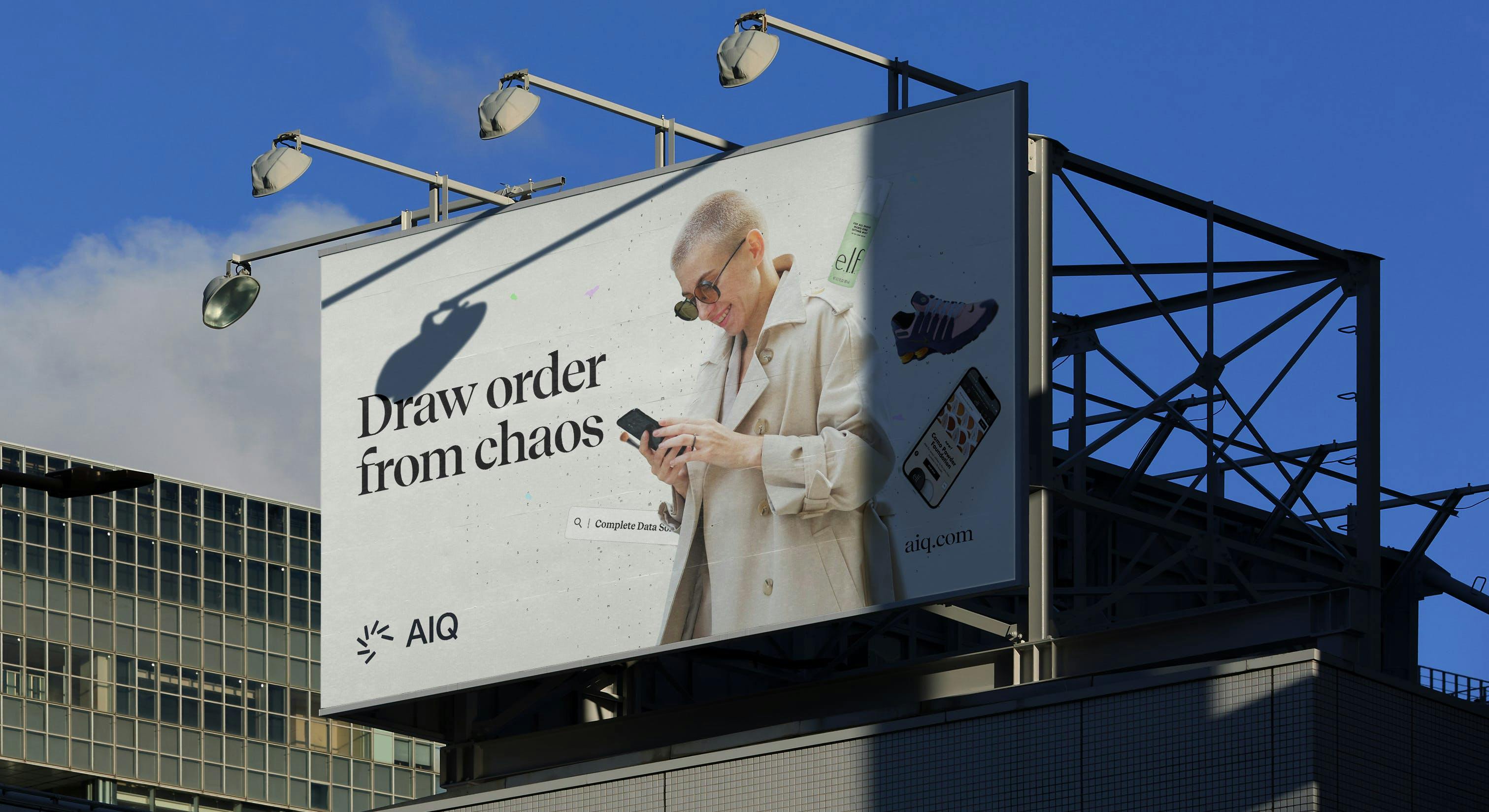
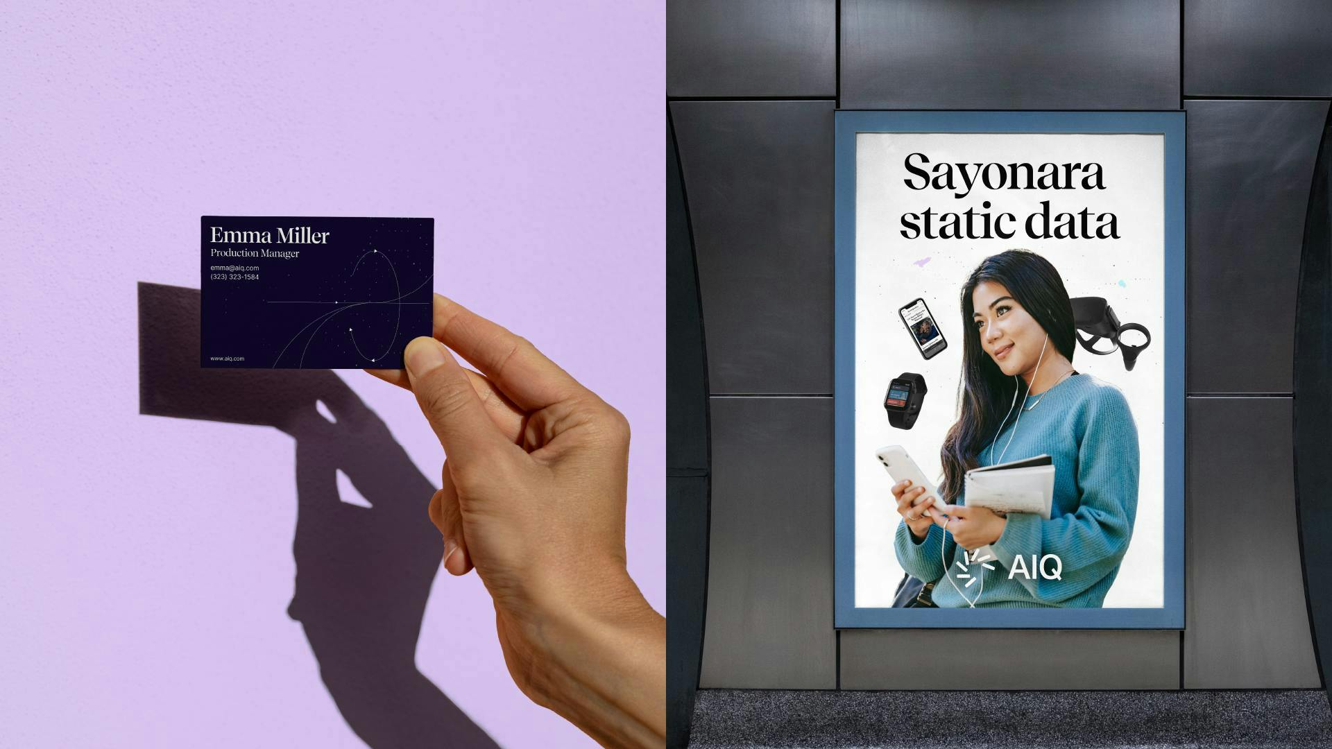
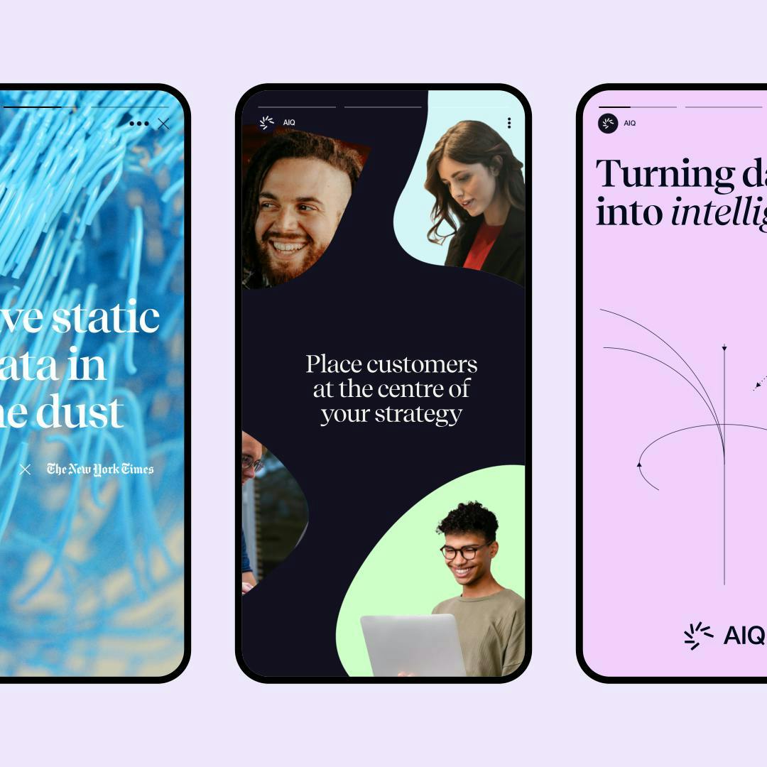
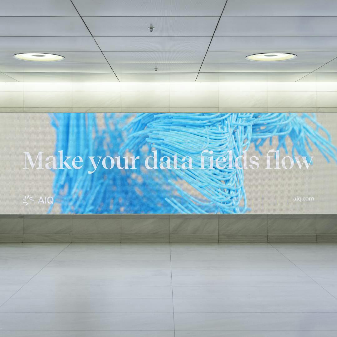
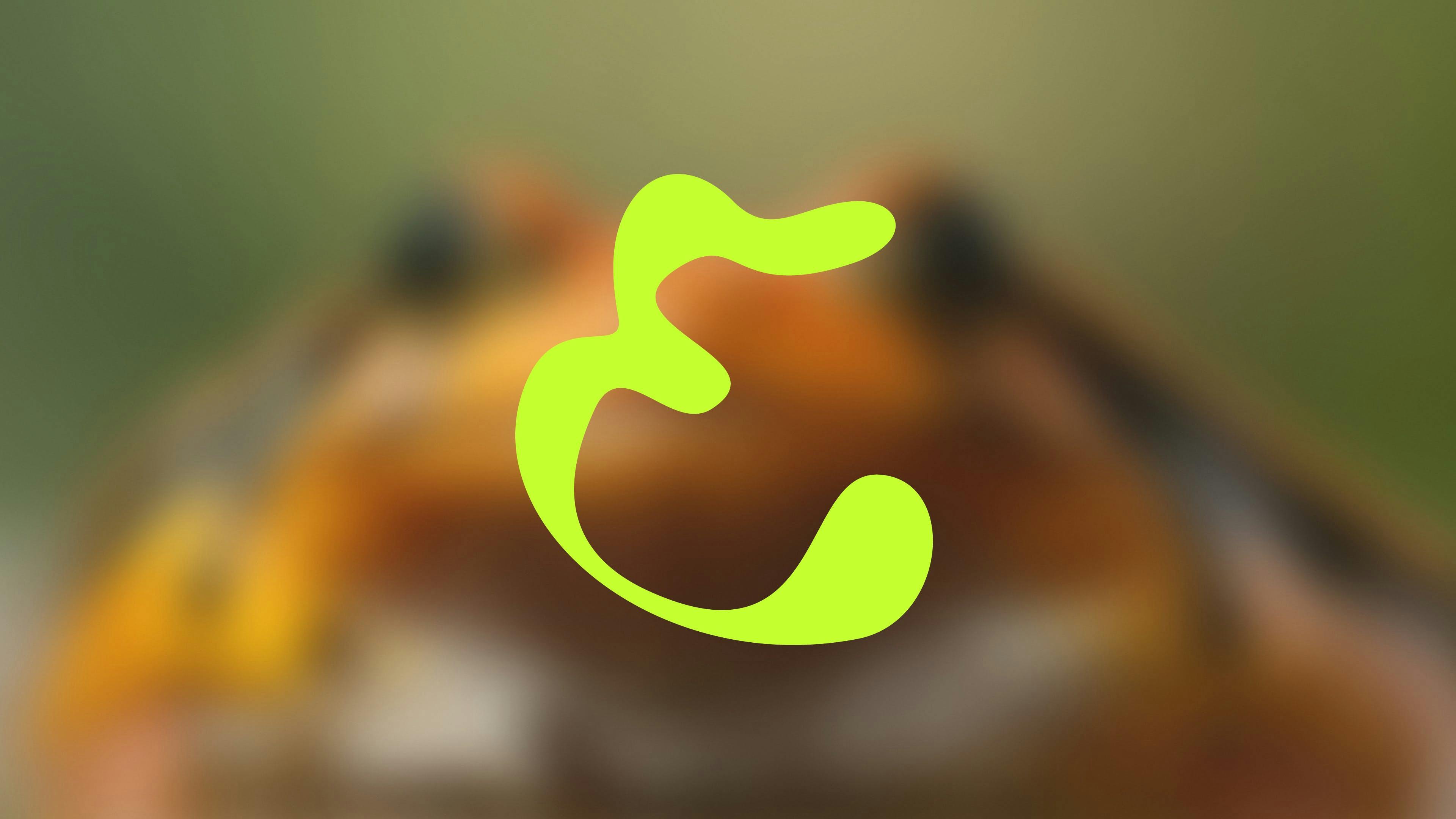
Magnetic Fields"Search" Field
The AIQ icon is based on the shape of a search bar—a device used by customers in their online Googles which the company collects and analyses.
Spun out into a cluster, these bars become magnetic filaments which are drawn towards a central gravitational point, i.e. the consumer.


"How&How was a critical partner in AIQ's brand evolution. The H&H team helped us turn a big visionary idea into a beautiful living and breathing brand which speaks to who we are as a company. The team is top-notch, delivers above and beyond expectations, and is an absolute pleasure to work with."
Director of Product Marketing, AIQ


"From the moment the work started, until our final phases together, it was clear How&How's processes and working style were rooted in positivity, open collaboration and approachable design. This was a recipe for an incredible output that hit our goals and exceeded our expectations. Not only is the work exceptional and in a class of its own, the people who make up How&How couldn't be more of a pleasure to work with at every turn."
Senior Product Manager, AIQ
View More Work


© 2026 How&How Ltd