Trackinsight
Oasis of analysis. How Trackinsight’s EFT resource silenced the noise of the investment market.


What’s the truth?
As a leading data-driven ETF investment resource, Trackinsight were already partnering with the likes of the Financial Times. But in a crowded investment market, its purely functional branding was only adding to the noise.
How’d we turn it up?
Our brand idea centred on the experience of what Trackinsight promised its audience: an oasis of analysis. A place where people can cut through the noise of the 6,000+ ETFs listed worldwide to find the one that’s right for them.
We went all in on


Inspired by spectacles and other sources of clarity, Trackinsight’s custom logotype contains modified ‘tittles’ of both ‘i’s in the shape of two semi-circular lenses.
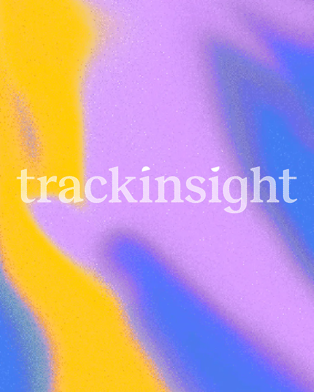


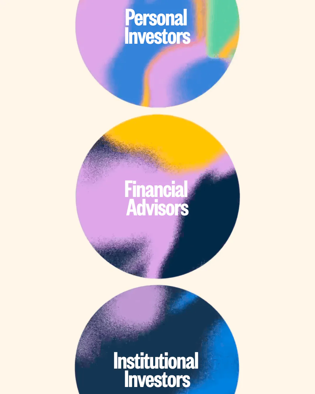
Razor-sharp graphic elements cut through the grainy ‘noise’ of gradients to convey the feeling of focus, complemented by 3D glass ‘lenses’.


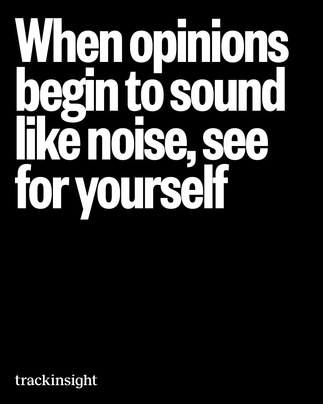
A partner of FT deserves a typeface worthy of a broadsheet. Founders Grotesk for display gives the brand an American editorial feel, while Inter was chosen for the product itself due to its varied UI capabilities.


"We really enjoyed working with HOW+HOW on our messaging, positioning and rebrand. Their team are smart, switched-on and went above and beyond to make sure we were happy and satisfied with every part of the process. We’re immensely proud of our beautiful new brand that we feel now really represents who we are, and the ambitions we have for ourselves. Merci!"
Its Nice That | Trackinsight

The Brand Identity | Trackinsight

Étapes | Trackinsight

Design Week | Trackinsight

Print Mag | Trackinsight

Brand New | Trackinsight

Design by Women | Trackinsight

Its Nice That | Trackinsight
The Brand Identity | Trackinsight
Étapes | Trackinsight
Design Week | Trackinsight
Print Mag | Trackinsight
Brand New | Trackinsight
Design by Women | Trackinsight
Its Nice That | Trackinsight
The Brand Identity | Trackinsight
Étapes | Trackinsight
Design Week | Trackinsight
Print Mag | Trackinsight
Brand New | Trackinsight
Design by Women | Trackinsight
Its Nice That | Trackinsight
The Brand Identity | Trackinsight
Étapes | Trackinsight
Design Week | Trackinsight
Print Mag | Trackinsight
Brand New | Trackinsight
Design by Women | Trackinsight
Its Nice That | Trackinsight
The Brand Identity | Trackinsight
Étapes | Trackinsight
Design Week | Trackinsight
Print Mag | Trackinsight
Brand New | Trackinsight
Design by Women | Trackinsight
Its Nice That | Trackinsight
The Brand Identity | Trackinsight
Étapes | Trackinsight
Design Week | Trackinsight
Print Mag | Trackinsight
Brand New | Trackinsight
Design by Women | Trackinsight
Credits
