Snooz
The world’s dreamiest ice cream. How we branded the only sweet that helps you sleep.
What’s the truth?
With 60% of ice cream consumed after 6pm, sugar spikes are doing nothing for our 8 hours. Replacing eye-opening emulsifiers and e-numbers with a soothing mix of drool-inducing ingredients, Snooz is the only sweet that gets you back to sleep.
How’d we turn it up?
Subverting the summery codes of ice-cream—the gingham, seascapes and jingles—we created a post-watershed brand that tucks you in and turns off the lights.
We went all in on

A logo you want to squish your face into with not one, but two eclipsed moons—finessing a wordmark that says night and night-night all in one.



Everything has a screen-saver quality to it which, animated with zero gravity, let you drift away into starry skies.


Our playful, NSFK (not suitable for kids) tone is more comfortable slinking into bed than scrolling at the dinner table.


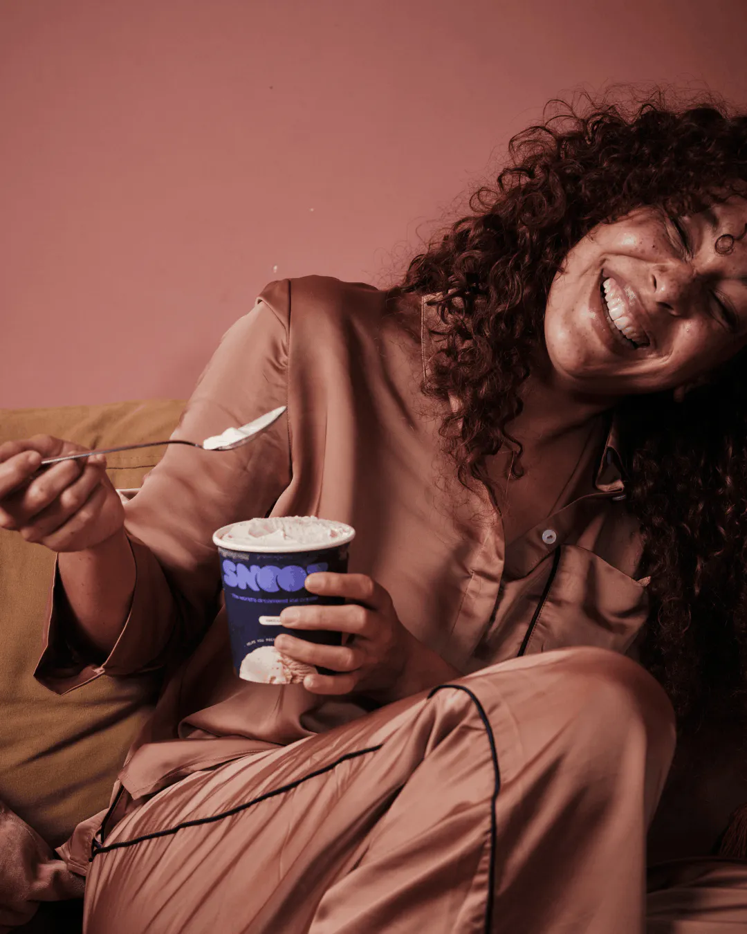
AD as cool as the contents of a Snooz tub, rebelling against over-saturated, outdoor imagery, with over-exposed, flash-on photos.


"Launching Snooz meant we had one shot to get it right—and HOW+HOW nailed it. With sharp thinking, serious creative talent, and a level of rigour you usually only see in much bigger agencies, they helped us define our positioning, shape a story people instantly understand, and build a brand identity that feels confident, premium, and distinctive in a crowded category.
"What impressed us most was how strategic they are. Every decision had purpose. No fluff. No trend-chasing. "Snooz is new to market, but we’re showing up like we’ve been here for years. That’s the power of a world-class brand—and HOW+HOW delivered it."

Creative Review | Snooz

The Dieline | Snooz

Brand Archive | Snooz

Trend Hunter | Snooz

The Grocer | Snooz

Creative Boom | Snooz

Creative Bloq | Snooz

The Future Lab | Snooz

Transform Magazine | Snooz

Brand New | Snooz

Foodbeast | Snooz

Sporked | Snooz

We & The Color | Snooz

Creative Review | Snooz
The Dieline | Snooz
Brand Archive | Snooz
Trend Hunter | Snooz
The Grocer | Snooz
Creative Boom | Snooz
Creative Bloq | Snooz
The Future Lab | Snooz
Transform Magazine | Snooz
Brand New | Snooz
Foodbeast | Snooz
Sporked | Snooz
We & The Color | Snooz
Creative Review | Snooz
The Dieline | Snooz
Brand Archive | Snooz
Trend Hunter | Snooz
The Grocer | Snooz
Creative Boom | Snooz
Creative Bloq | Snooz
The Future Lab | Snooz
Transform Magazine | Snooz
Brand New | Snooz
Foodbeast | Snooz
Sporked | Snooz
We & The Color | Snooz
Creative Review | Snooz
The Dieline | Snooz
Brand Archive | Snooz
Trend Hunter | Snooz
The Grocer | Snooz
Creative Boom | Snooz
Creative Bloq | Snooz
The Future Lab | Snooz
Transform Magazine | Snooz
Brand New | Snooz
Foodbeast | Snooz
Sporked | Snooz
We & The Color | Snooz
Creative Review | Snooz
The Dieline | Snooz
Brand Archive | Snooz
Trend Hunter | Snooz
The Grocer | Snooz
Creative Boom | Snooz
Creative Bloq | Snooz
The Future Lab | Snooz
Transform Magazine | Snooz
Brand New | Snooz
Foodbeast | Snooz
Sporked | Snooz
We & The Color | Snooz
Creative Review | Snooz
The Dieline | Snooz
Brand Archive | Snooz
Trend Hunter | Snooz
The Grocer | Snooz
Creative Boom | Snooz
Creative Bloq | Snooz
The Future Lab | Snooz
Transform Magazine | Snooz
Brand New | Snooz
Foodbeast | Snooz
Sporked | Snooz
We & The Color | Snooz
Credits

