Sauce Labs
Developer 3.0. How Sauce Labs put its tools to the test to pioneer new levels of performance.
What’s the truth?
Sauce Labs is leading the way in software testing tools. But through multiple acquisitions and a shift towards enterprise-level solutions, the software teams actually using its platform had been forgotten. It was time to put them back in the limelight.
How’d we turn it up?
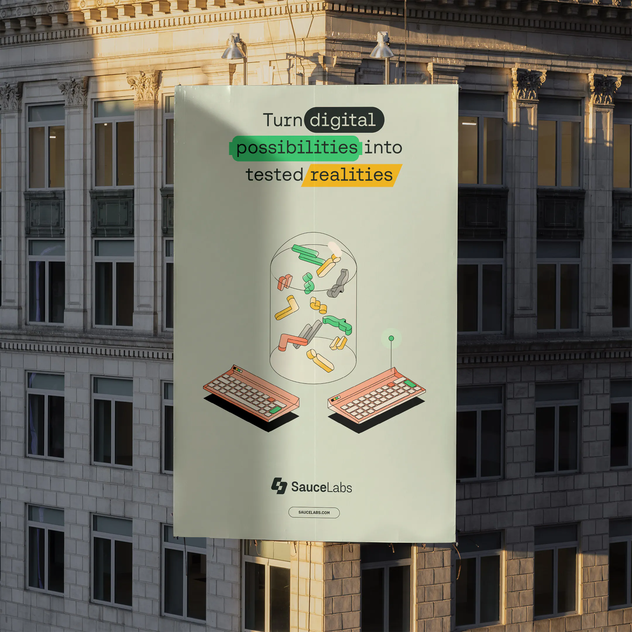
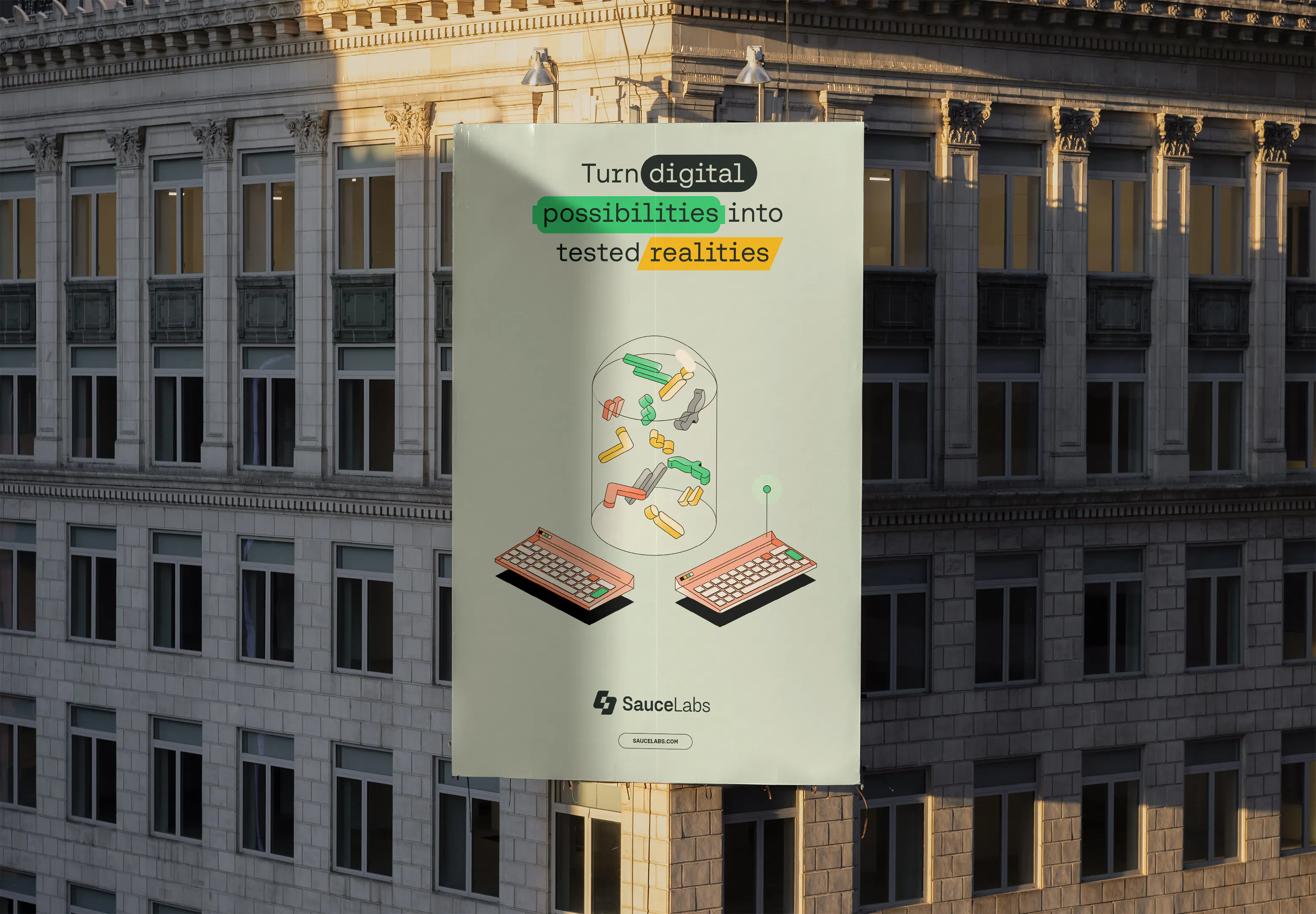
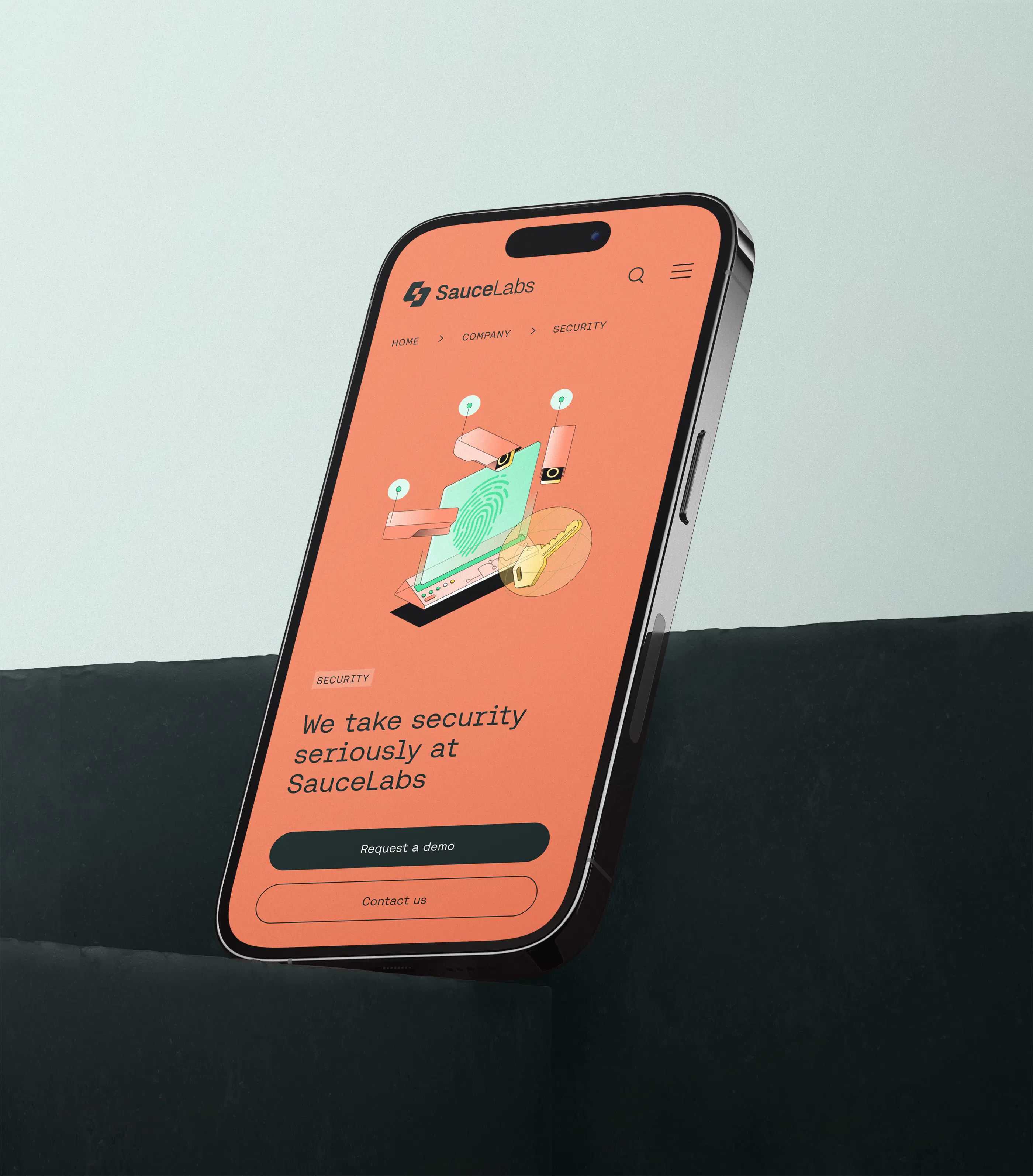
We made software teams the hero of the story, turning their reputation from back-end builders to performance pioneers with a brand system inspired by speed, focus, and growth. Or, as they would put it: Test. Update. Accelerate.
We went all in on
Brand New Year in Review 2023: Best in Color

Awwwards: Mobile Excellence

Brand New Year in Review 2023: Best in Illustration
Awwwards: Honorable Mention
Brand New Year in Review 2023: Best in Color
Awwwards: Mobile Excellence
Brand New Year in Review 2023: Best in Illustration
Awwwards: Honorable Mention
Brand New Year in Review 2023: Best in Color
Awwwards: Mobile Excellence
Brand New Year in Review 2023: Best in Illustration
Awwwards: Honorable Mention
Brand New Year in Review 2023: Best in Color
Awwwards: Mobile Excellence
Brand New Year in Review 2023: Best in Illustration
Awwwards: Honorable Mention
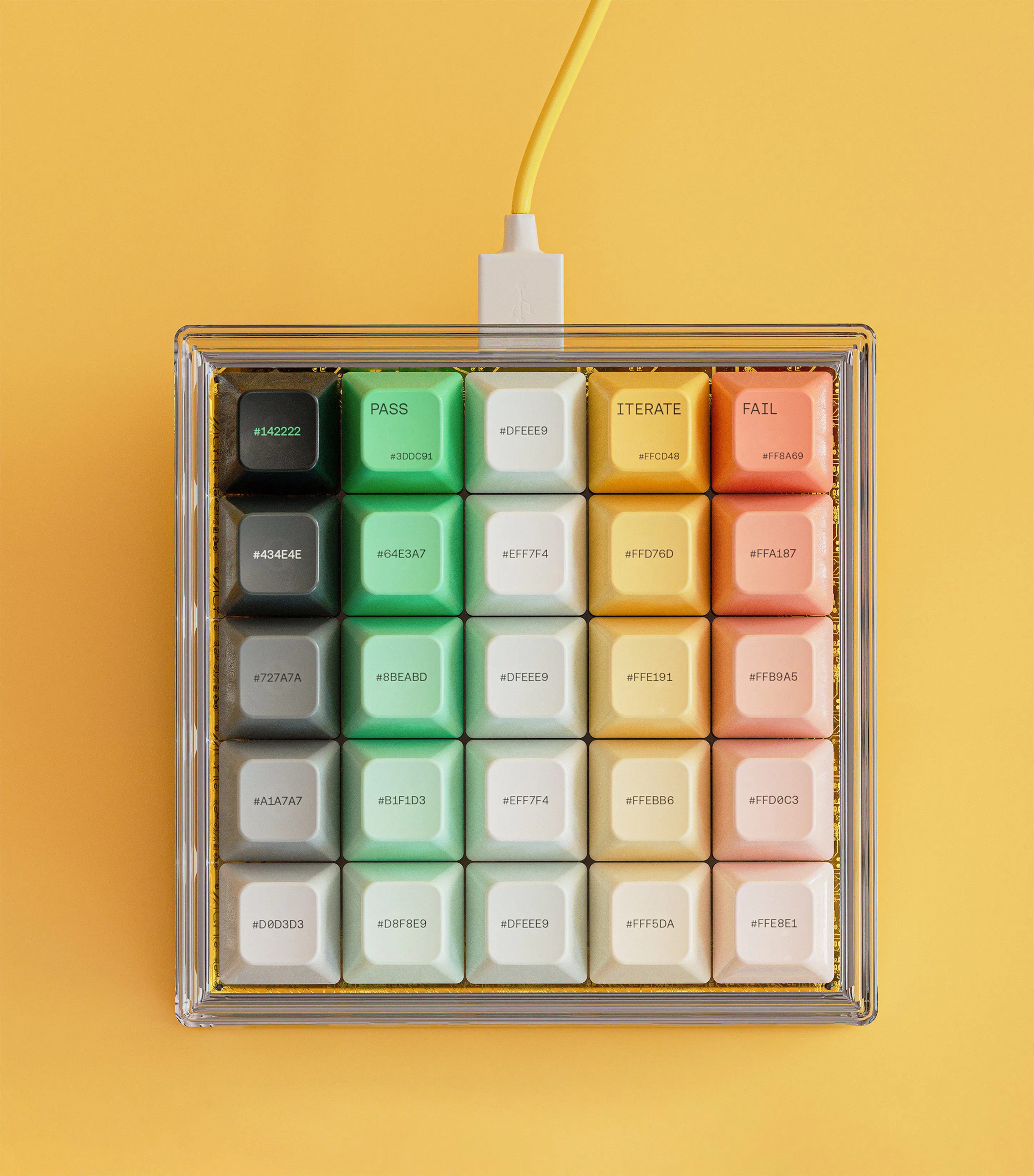
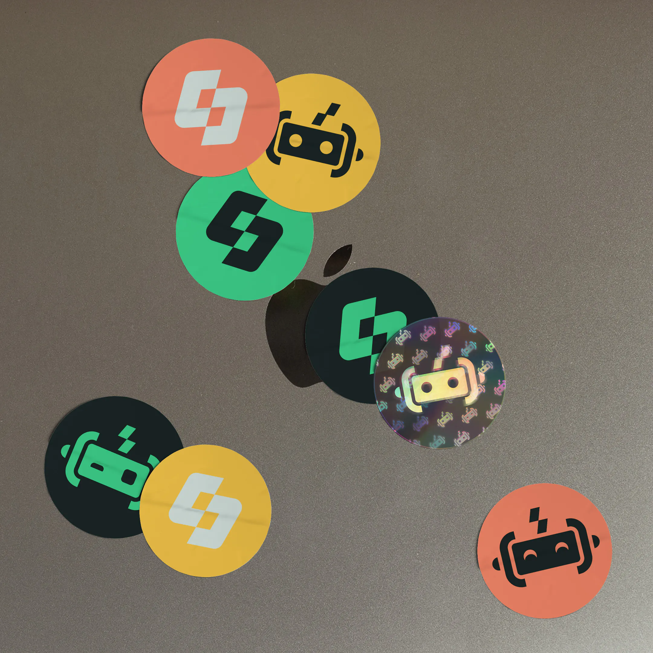
Our palette follows the traffic light system of testing with a core green and complementary amber and coral. Tints, shades and ratios allow for flex while ensuring accessibility.




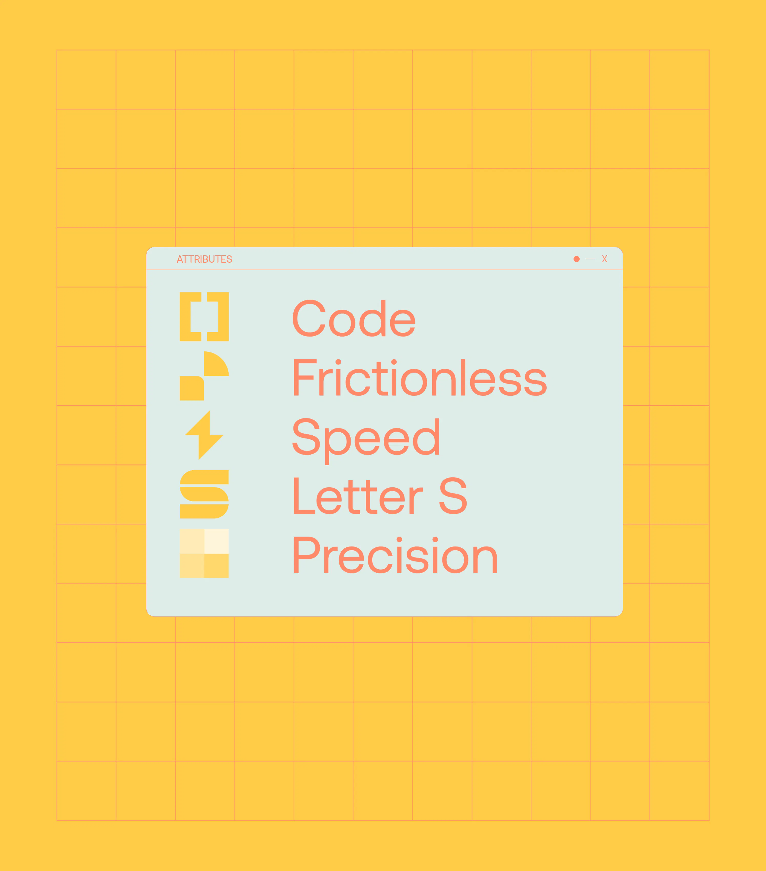
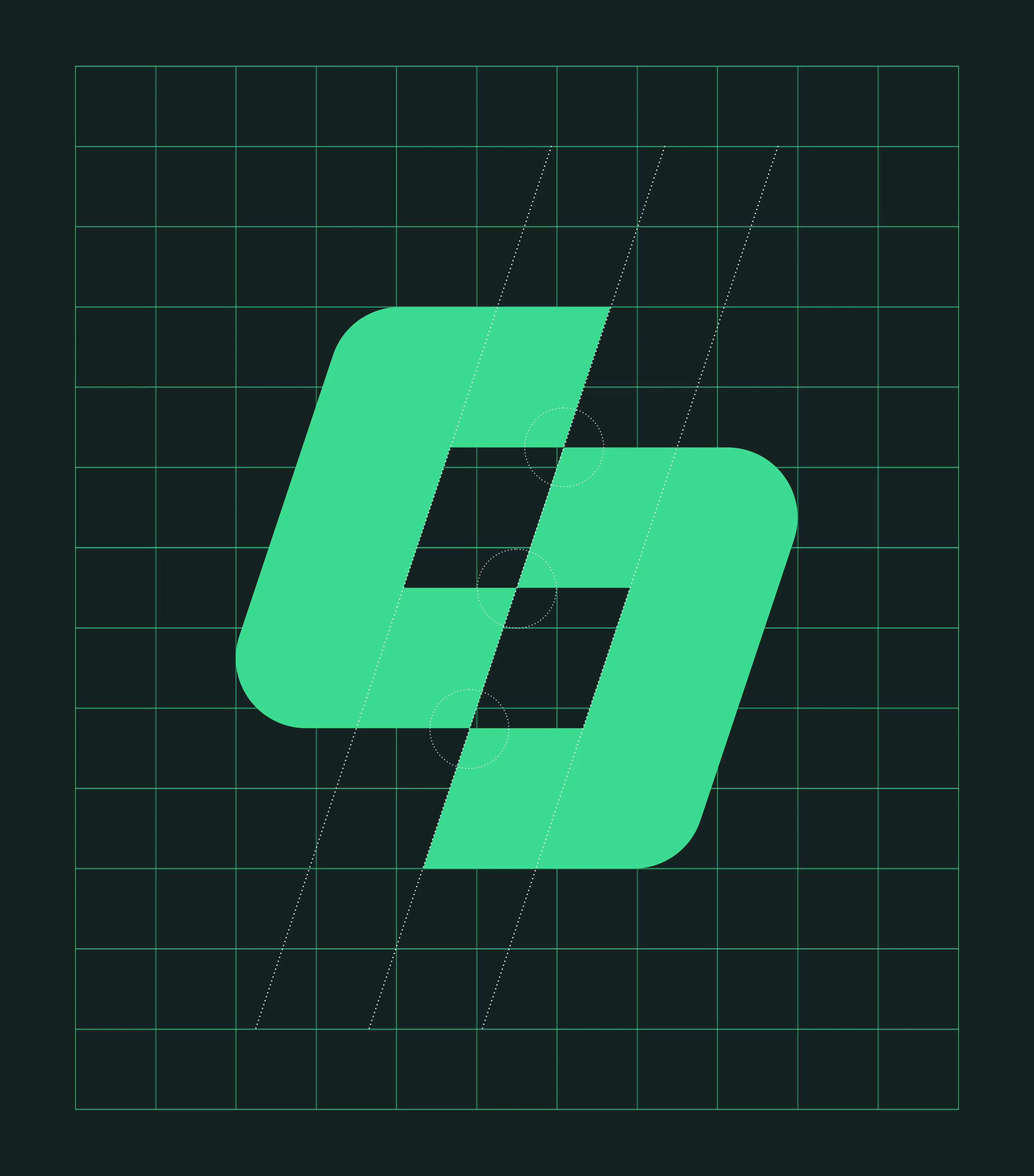
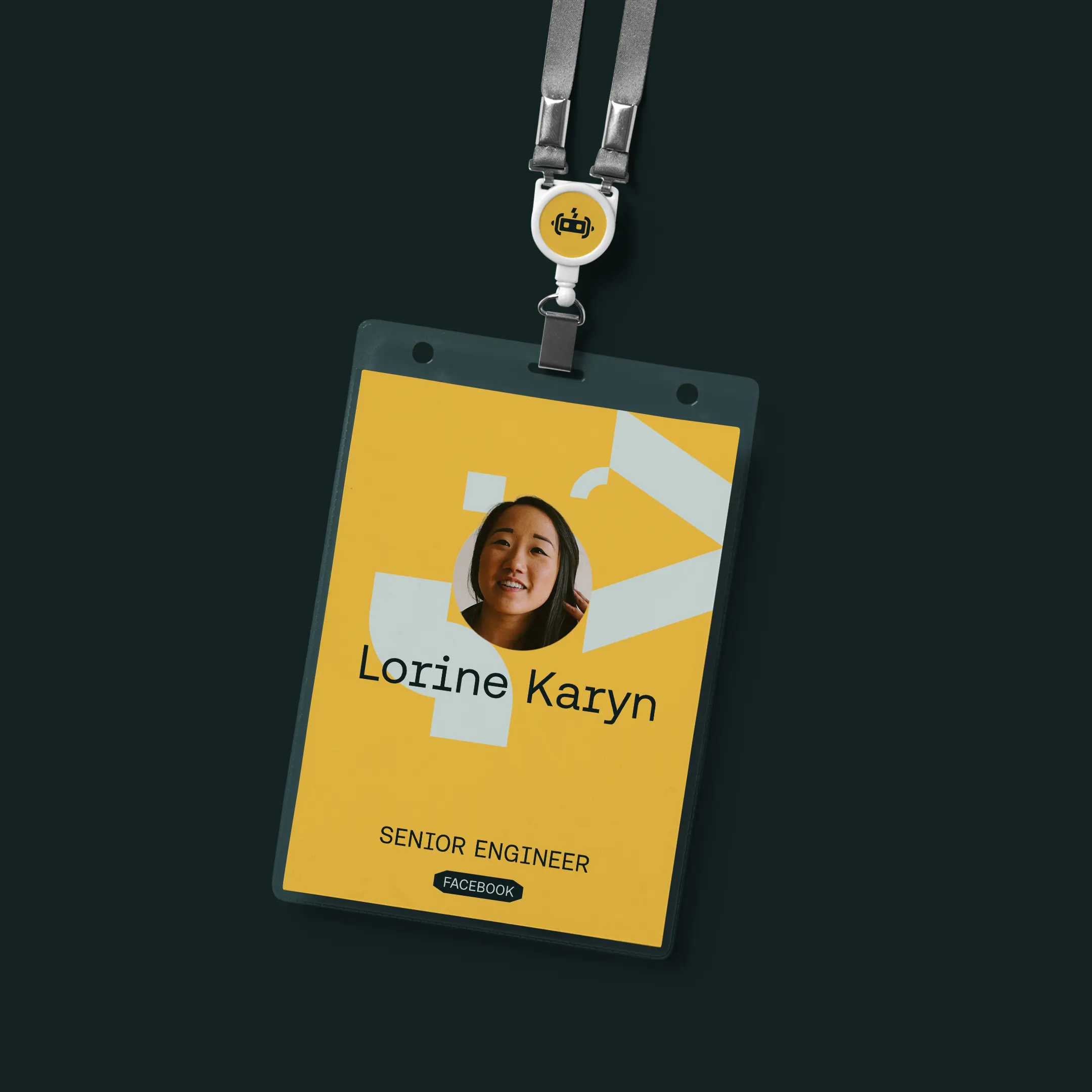
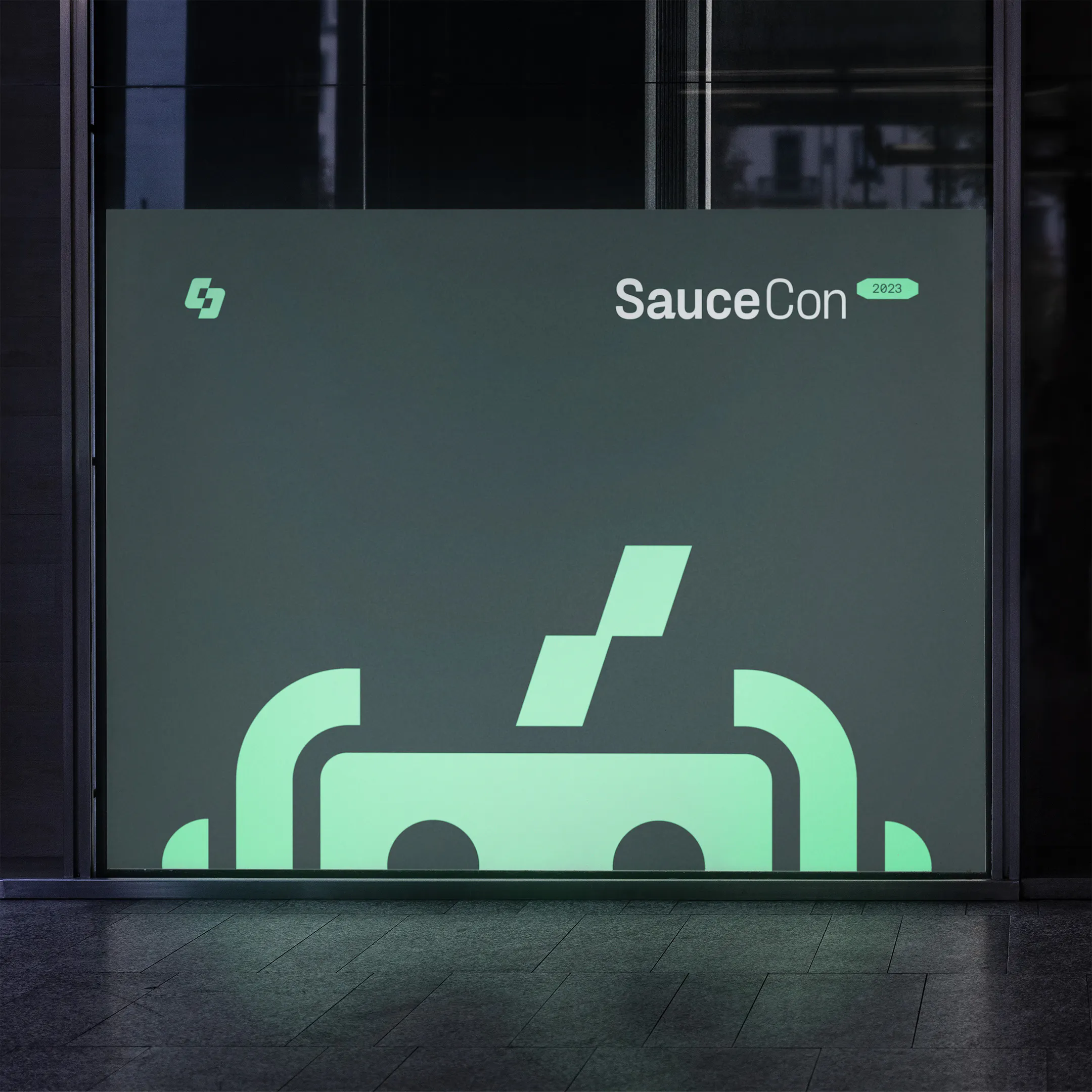
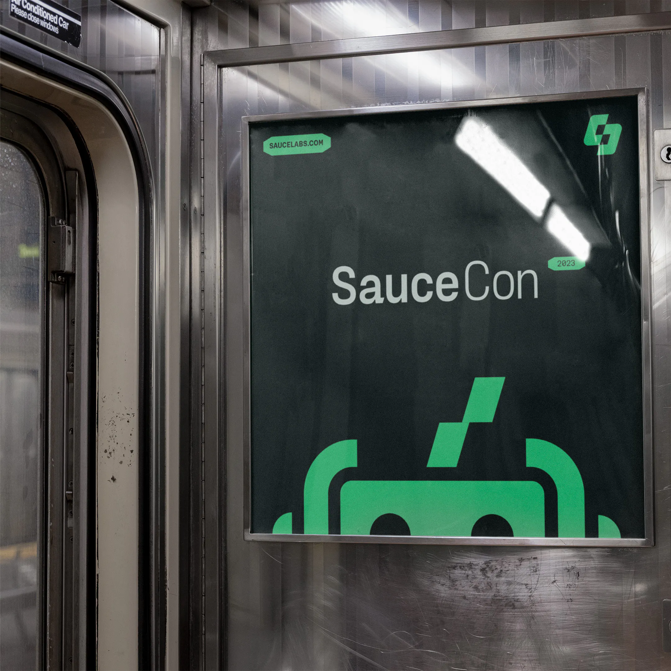
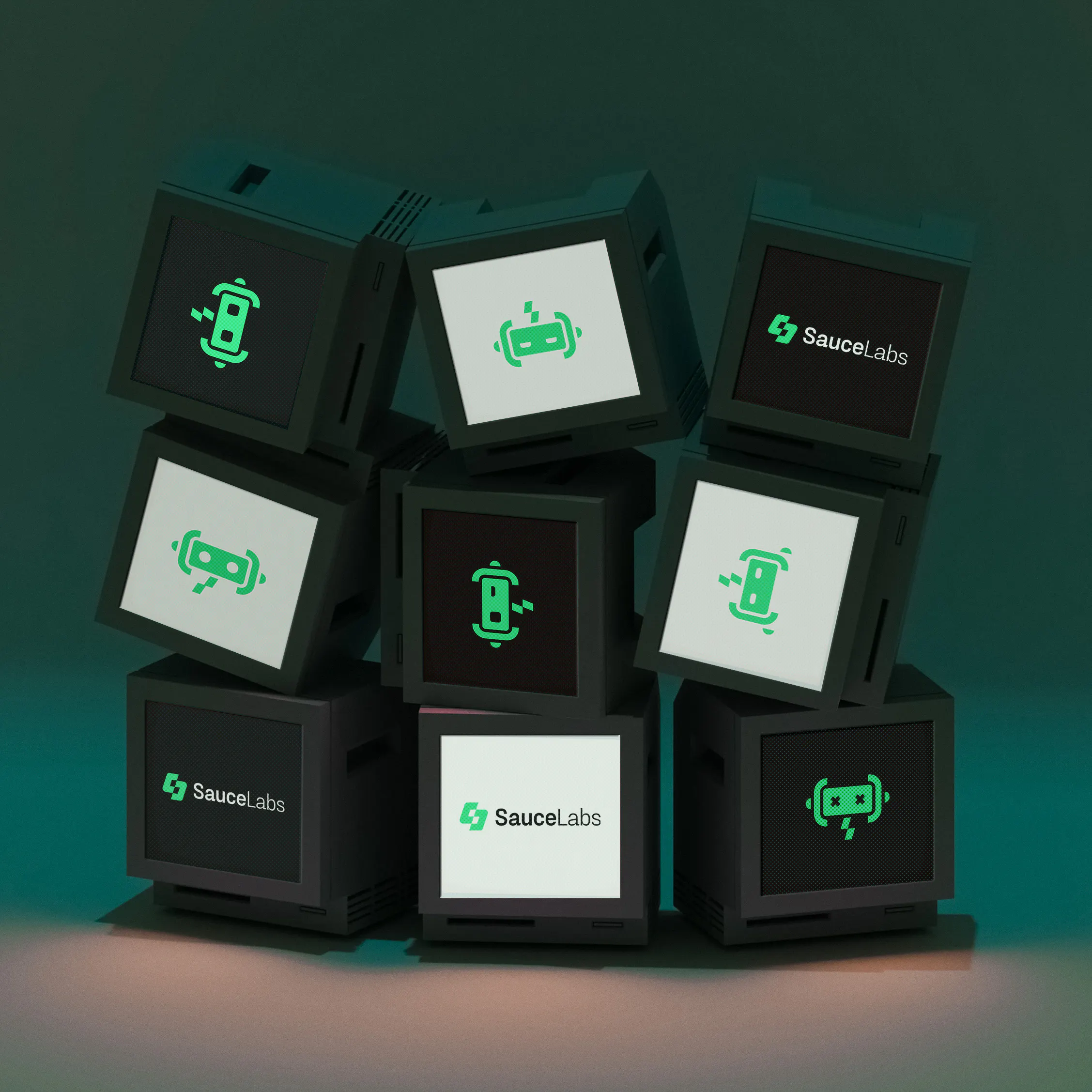
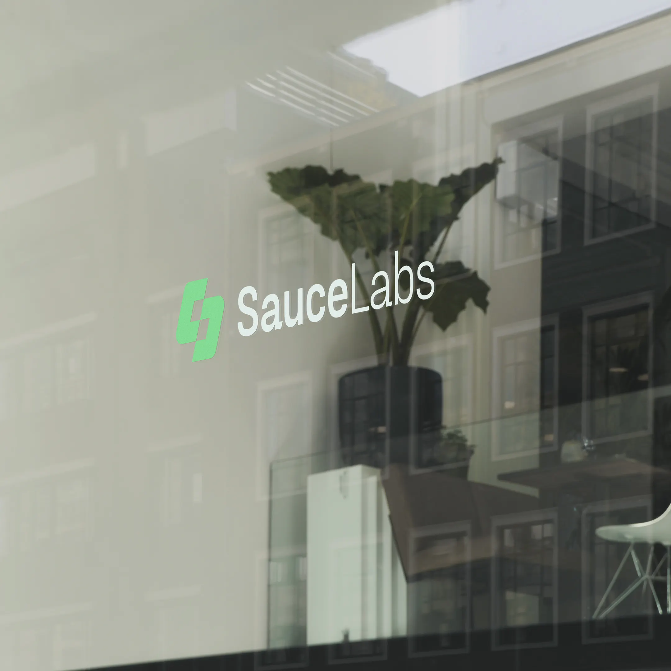
Code brackets are crafted to form a new ‘S’ shape that’s as frictionless as the development process. A lightning bolt reveals itself in the negative space to express speed and precision.

"The only thing more rewarding than the collaborative process of the HOW+HOW team would be the amazing results. We all felt they understood what we were trying to achieve and went above and beyond our expectations. Across the board, our whole team are genuinely thrilled with our amazing new website and great new brand."


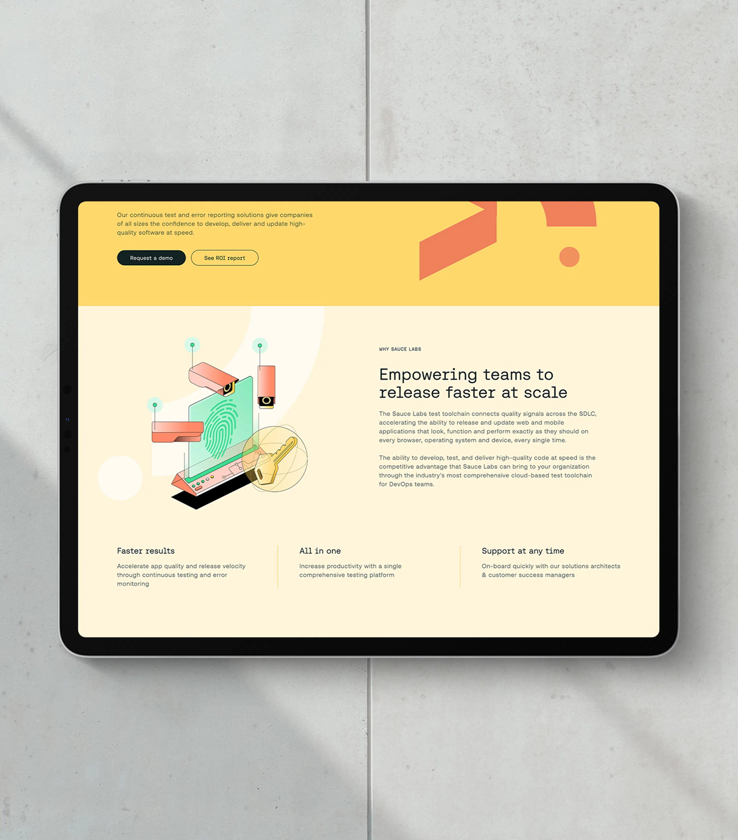
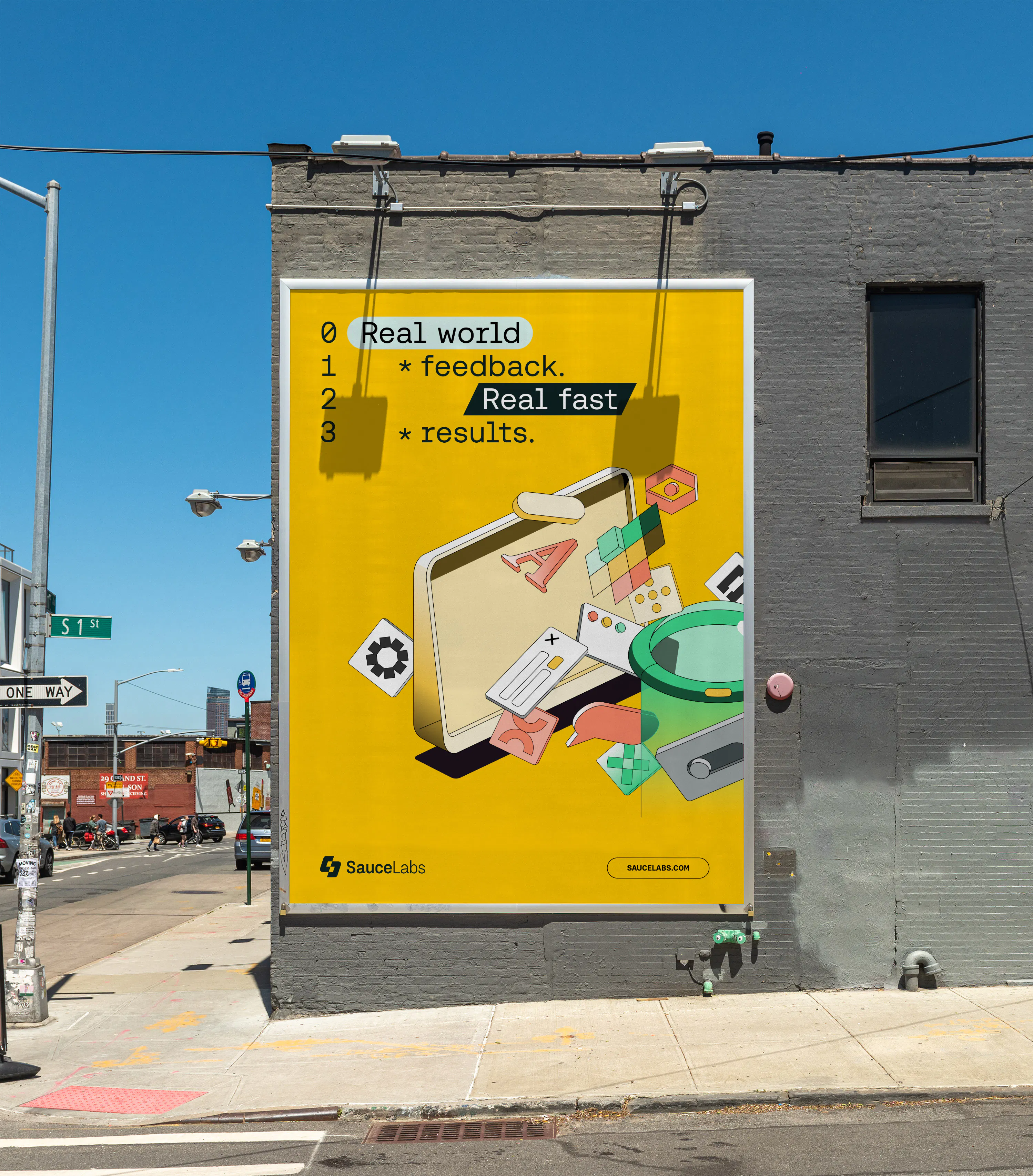
Aeonik Fono offers a contemporary twist on classic developer style typography, while code syntax was used to create graphic highlighters, textural moments and product logos.

Creative Boom | Sauce Labs

Design Week | Sauce Labs

The Brand Identity | Sauce Labs

Brand New | Sauce Labs

Creative Boom | Sauce Labs
Design Week | Sauce Labs
The Brand Identity | Sauce Labs
Brand New | Sauce Labs
Creative Boom | Sauce Labs
Design Week | Sauce Labs
The Brand Identity | Sauce Labs
Brand New | Sauce Labs
Creative Boom | Sauce Labs
Design Week | Sauce Labs
The Brand Identity | Sauce Labs
Brand New | Sauce Labs
Proof of the truth
Credits

