Big Cartel
Goodbye, caution! How Big Cartel’s OG e-commerce platform gave entrepreneurs the courage to leap.
What’s the truth?
Big Cartel is the OG 00s e-comm platform, inspiring creatives to launch their wares to the world for 20 years. But with over 600 competitors fighting for the same 4.9m businesses, it needed to do as its sellers do: find the audience and make the sale.
How’d we turn it up?
We threw caution out the window. Going against the established Shopify approach of e-comm to create a scrappy identity which gives plucky, daydreamers the tools to stop dreaming, and start doing.
We went all in on


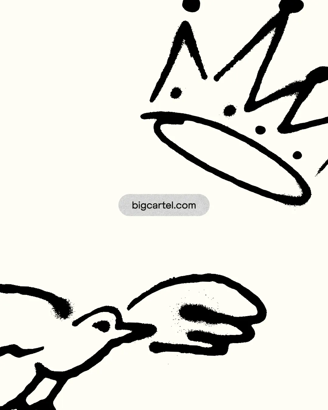
A rabble-rousing logo that carries 20 years of noughties goodwill into today, and proves you don’t have to be picture-perfect to make it on the web.

Inspired by the ideas entrepreneurs scribble onto napkins and into notebooks—free-spirited, loose and as scrappy as the overall brand.

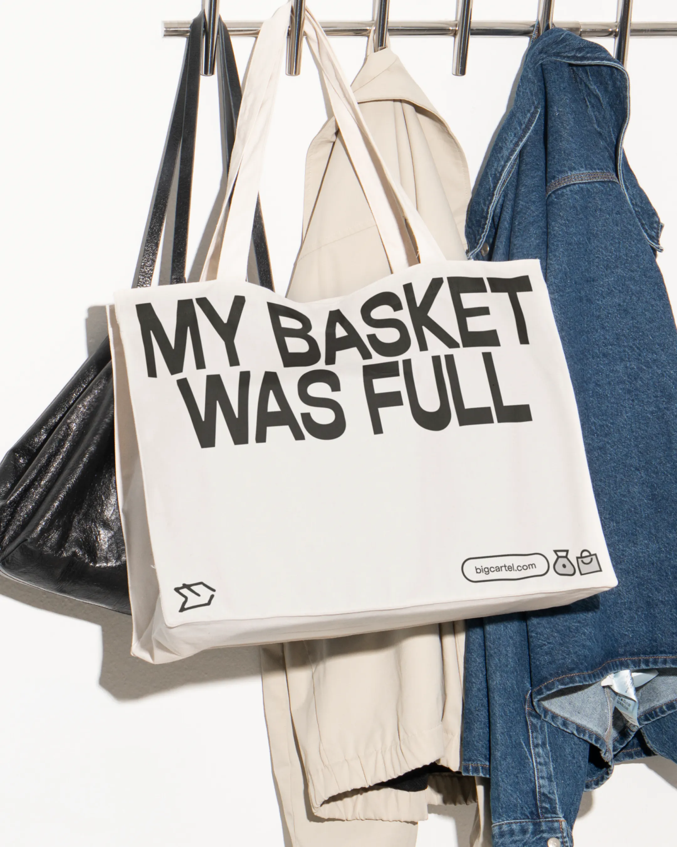
A punchy voice that motivates members to market their wares, delivered in a headline style that slices through any self-doubt.


Risograph textures speak to the indie roots of Big Cartel and respect the maker culture which has driven its success since 05.

"Working with HOW+HOW has been a great experience. They guided us towards a brand strategy that feels spot on for our customers and gives us a solid foundation to grow into new markets, developing a new voice, visual identity, and marketing site that brings it all to life.
"The team was organised, responsive, and easy to work with throughout—even rolling with an unplanned logo and wordmark redesign, iterating until it felt right. What stood out most was how well they listened, not just to us but to our customers, and that care shows in the final work. We couldn't be happier with the results."


Brand New in Review 2025: Best in Icon Sets

It's Nice That | Big Cartel

Creative Review | Big Cartel

BP&O | Big Cartel

Design Week | Big Cartel

Creative Boom | Big Cartel

Creative Bloq | Big Cartel

Brand New: Under Consideration | Big Cartel

It's Nice That | Forward Thinking
The Brand Identity | Big Cartel

Abduzeedo | Big Cartel

We & The Color | Big Cartel

Brand New in Review 2025: Best in Icon Sets
It's Nice That | Big Cartel
Creative Review | Big Cartel
BP&O | Big Cartel
Design Week | Big Cartel
Creative Boom | Big Cartel
Creative Bloq | Big Cartel
Brand New: Under Consideration | Big Cartel
It's Nice That | Forward Thinking
The Brand Identity | Big Cartel
Abduzeedo | Big Cartel
We & The Color | Big Cartel
Proof of the truth
Credits

